It’s amazing when fonts turn up in the news. As everyone in the type business has undoubtedly heard by now, Ikea decided to switch from one typeface to another for its catalogs and ads, and all hell broke loose on Twitter. You wouldn’t think that a typographic design change would generate that much heat, but lots of people (not all of them typographers or graphic designers) have expressed outrage – outrage! – at Ikea’s dropping its longstanding catalog typeface, a custom version of Futura, and replacing it with, of all things, Verdana. Shock! Horror! A web font!
Verdana was designed in the 1990s for Microsoft, developed specifically as a typeface for reading onscreen. The designer, Matthew Carter, has long experience of virtually every kind of typeface technology, and he brought that to bear on designing Verdana. Since text on a computer screen appears, of necessity, at pretty coarse resolution, the outlines of the letters have to be adapted somehow when rendering them at small sizes; there simply aren’t enough pixels available to reproduce the outline shapes perfectly. That’s where the art and craft of designing screen fonts comes in: making the most of those extreme limitations. In what was at the time a revolutionary turnabout, Carter first designed bitmapped letters for each of the target sizes, positioning pixels to get the most legible shapes he could; then he drew the outlines for the higher-resolution letters, based on the shapes of the lo-res bitmaps. Tom Rickner, a wizard of digital font technology, then created the “hints” that would tell the font software exactly how to distort the outlines at a particular size, when drawing a character on the screen, in order to achieve the ideal bitmap at that size.
One of the things that make Verdana legible onscreen, compared with a lot of other typefaces, is the generous space around the characters. There’s always a tendency among web designers to try to cram in as much material as possible in the space available, but that works against clarity and legibility. Without enough space between the letters, they all tend to run together. We’ve all seen this, much too frequently, on our computer screens. The clear, open shapes of Verdana’s letters can vary quite a bit from size to size at small text sizes onscreen, but one thing they have in common is that they’ve been given enough space to breathe.
Although Verdana was meant primarily for onscreen reading, it works surprisingly well on paper as well. It’s a simple, clean, unpretentious sans serif typeface, easy to read. I’ve used it for years as the typeface for manuscripts and drafts of anything I’m writing, because it’s easy to read both onscreen and on paper and it gets out of the way. I realized seven or eight years ago that Verdana had passed into general use, when I saw it on a billboard in San Francisco. (The same characteristics that make it legible onscreen may make it easy to read at a distance as you’re driving by.) I’ve never tried using Verdana in print, but I can imagine situations where I might want to.
It’s funny to see the choice of Verdana lambasted because it was designed for a different purpose. As Erik Spiekermann has pointed out, many of our most versatile typefaces were originally designed for one specific purpose, answering a particular set of constraints (Times New Roman, for instance, which was designed for the presses that printed The Times in 1931). Even Bell Centennial and Bell Gothic, both of which were designed for the listings in American telephone books, have been used successfully at huge display sizes by editorial designers with an eye for the unusual. Perhaps Verdana has unexpected uses as well.
I have no strong opinion about Ikea’s redesign. Certainly Verdana’s numerals are very clear and readable – even stylish, in a chunky, sturdy sort of way – and the numerals are what end up at the largest size on the pages of an Ikea catalog. And I alway felt that the Ikea version of Futura was a little too tightly spaced, though that’s not the fault of the typeface but of how it’s used.
One of the reasons Ikea chose Verdana is that it works across quite a lot of languages and scripts. The basic fonts include Greek and Cyrillic alongside the extended Latin alphabet; and Microsoft’s Japanese typeface Meiryo is based on Verdana, with the romaji (Latin letters) being essentially slightly revised and sharpened versions of Verdana’s designs. (As near as I can tell, from Ikea’s Japanese web pages, the Japanese catalog does use Meiryo, although with a different typeface for some text.)
Verdana may be about to become more versatile for both web and print use, since Ascender Corporation just announced that they are working with Matthew Carter and the Font Bureau to extend both the Verdana and the Georgia families with new weights and widths.
Whatever the merits of the case, what strikes me most forcefully in all of this is that a debate about which font to use could even be noticed, much less become a cause célèbre in the public consciousness. What typographic times we live in!
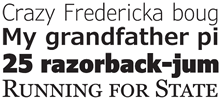
[Images: two details from Ikea’s U.S. website (top and middle); sample of some of the forthcoming new members of the Verdana and Georgia families.]


