Almost everything about the iPhone seems to be brilliantly designed. Almost. The big exception is the font. What on earth were they thinking? Helvetica?
Helvetica has many virtues, as the recent movie makes clear. But the same thing that makes it so smooth, so all-of-a-piece, is what makes it hard to differentiate one letter from another – and particularly one number from another. Helvetica’s numerals are among the hardest in the world to tell apart, yet Helvetica gets used over and over again in situations where telling those numerals apart is essential: on business cards, for instance. I am continually irritated by Apple’s Address Book program, where it’s hard to tell at a glance whether I’m looking at a 3 or an 8, a 6 or a 5. The same thing crops up in Apple Mail, where the number of messages in a mailbox is communicated in little Helvetica numerals, faint against a pale background.
Apple is a company whose corporate culture understands design. So it’s astonishing to see them make such a foolish choice. Does Apple’s designers’ visual resolution not extend to fonts? Do they never look up a phone number, or quickly glance at the date on a calendar?
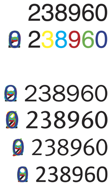
As an exercise for the user, here are the most easily confused numerals. At the top is Helvetica, first in black and then with each numeral in a different color. On the left is a composite of all of them overlaid on top of each other. The four lines below show the same numerals in ITC Franklin Gothic, ITC Stone Sans, FF Meta, and Calibri. I’m only showing the “lining” or uppercase figures, which are all the same height. Which do you find easiest to read?