I have continued my memoir of falling into phototypesetting and working in a small print shop in Seattle in the late 1970s/early 1980s. Franklin Press moved from Capitol Hill to Pioneer Square within a month of my starting there. Being in the heart of the city, and in the heart of Seattle’s pre-grunge alternative culture, I felt intimately connected with the life of the city. And I was learning a craft I had never suspected that I would take up.
![]()
easilyamused |
Archive for July, 2020
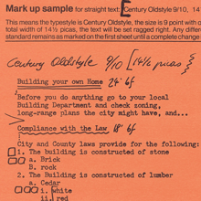
Setting type on Skid Row
Published
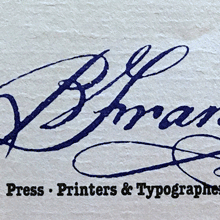
Franklin Press
Published
More history, this time my own. As I worked on researching the first part of a history of ATypI, I came to realize that I myself had been around long enough that my recollections formed part of typographic history. So I’ve started writing down my memories of how I got involved with typography – a sort of typographic memoir. I came to type sideways, like everything else in my so-called career. I’ve just posted a draft of the first bit on Medium. Return with us now to those thrilling days of yesteryear…

Designers of books
Published
“Who’s your favorite book designer?” That was the innocent-seeming question that Deborah Iaria, an Italian typographer based in London, asked me yesterday, during one of TypeThursday’s one-to-one “coffee” chats on Zoom. We had just established that we both loved designing books, so that question didn’t come out of the blue. But it’s a question I haven’t been asked very often, unlike the much more common query, “What’s your favorite typeface?” (My reply to that is usually, “It depends on what I’m going to use it for,” followed by naming a few perennial favorites like Verdigris, Dolly, Profile, and Beorcana.)
After a long pause while I pondered the question, I decided on an answer: the late San Francisco printer Jack Stauffacher. Not only had I learned a lot from Jack in person, but examples of his aesthetic and his craft, even before I met him, had taught me a lot of what I know about placing text and image on a page. And about the importance of books as carriers of culture.
But since that conversation, I have kept coming back to the question. There are lots of excellent book designers, both historical and contemporary, but which ones have influenced me the most? Which ones are my “favorites”?
From the first half of the 20th century, I would cite Jan Tschichold, W.A. Dwiggins, and Bruce Rogers as primary influences. And Jack Stauffacher’s old friend, whom unfortunately I never met: Adrian Wilson. From my own time, I greatly admire the work of the late Steve Renner, long-time art director at the University of California Press, whose spare, modern style always seemed in direct contradiction to his passion for restoring old hotrod cars.
Two more recent designers whose work I have tried to emulate are David Bullen and Tree Swenson. David Bullen established and maintained the high standards of the Berkeley-based North Point Press in the 1980s (the initial templates owed a lot to Jack Stauffacher), which was a model to me of an independent book publisher of works worth reading. Tree Swenson was the long-time publisher and designer of Copper Canyon Press, the eminent international poetry publisher in Port Townsend, Washington. After Tree left and Sam Hamill asked me to take over as house designer, it was Tree’s established standards of quality that I tried to live up to. (I was very happy when she seemed to think that I had succeeded.)
Others who leap to mind are Valerie Brewster, who later took over much of the book design for Copper Canyon and has produced many, many subtly and elegantly designed books, and Saki Mafundikwa, who was an art director at Random House before returning to Zimbabwe to found the visual/digital design school ZIVA, and who wrote and designed the seminal book Afrikan Alphabets. And John Hubbard, whom I worked with at Marquand Books in the 1990s, and who has continued to design exquisite art books ever since. No doubt I’ll think of more the moment I commit this post to pixels.
I haven’t even considered anyone from before the turn of the 20th century, and I’m not reaching beyond the Western world of printing and publishing. I’ve seen some brilliant book designs from Japan and China, but since I can’t read either language, I can’t really consider them to be influences on my ideas about text typography.
So: who’s your favorite book designer?

Garamondiale
Published
There always seems to be another Garamond. Eight years ago I wrote about this proliferation, not for the first time, inspired by an article that James Felici had just written for Creativepro (“Will the Real Garamond Please Stand Up?”); in that blog post I reprinted a thumbnail version of the “Garamond family tree” that I had first put together twenty years earlier for an article for Aldus magazine about typeface revivals.
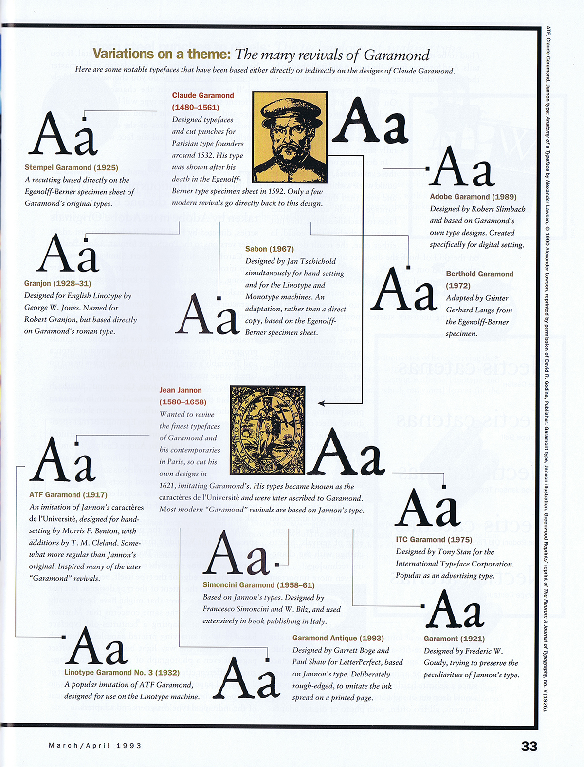
By 2012 there were many more Garamond versions than my attempt at a family tree had dealt with, notably Robert Slimbach’s masterful Garamond Premier Pro. And of course there are still more versions today, including a libre version available from Google Fonts, called EB Garamond, that is based on the 1592 Egenolff-Berner type specimen, and Mark van Bronkhorst’s faithful recent revival of the popular ATF Garamond. (Full disclosure: I wrote the promotional copy for digital ATF Garamond.)
I’m not quite prepared yet to attempt an update of that Garamond family tree, but it might be a project worth pursuing. The tree would certainly have many more branches now than it did almost thirty years ago. But the primary distinction remains: between type designs based on Claude Garamond’s original 16th-century punches, and those based on Jean Jannon’s more baroque 17th-century imitation, which for a long time were attributed to Garamond.
Another distinction appears in the various italics. Although Claude Garamond did cut italic types, many of the Garamond revivals eschew his design in favor of an italic based on his contemporary Robert Granjon’s italic types, which type critics often find more finished or more elegant. The italics cut by Jean Jannon have yet another style, even more baroque than his romans.
(“Baroque” may be the wrong word, given some of the very different types from the 17th century that have been described as baroque by type historians, but it seems to me to capture the slightly more ornate style of Jeannon’s types compared to Garamond’s.)
The most commonly used version today is undoubtedly Monotype Garamond, which is the “Garamond” font family installed with every Windows system, and which therefore is what most people think of when they see the name “Garamond.” Monotype Garamond is based on Jean Jannon’s 1615 types, and in its more interesting alternative (not the version shipped with Windows) its italic features ascending letters with varying angles, instead of the regularized slope more common in type revivals.
For practical use right now in digital typesetting, the most useful Garamonds are probably Garamond Premier Pro and ATF Garamond – one based on the original Garamond types, the other on the later Jannon iteration. Both include extensive OpenType features, and both come in multiple optical sizes, for optimal use at different sizes in text or display. Both families also include a Medium weight, slightly heavier than the Regular, for an alternative, more robust effect in running text.
In Wikipedia, I currently find myself referenced three times in the footnotes of the “Garamond” article – though not, interestingly enough, for my 2012 blog post or the Garamond family tree in Aldus magazine.
John D. Berry, ed. (2002). Language Culture Type: International Type Design in the Age of Unicode. ATypI. pp. 80–3. ISBN 978-1-932026-01-6. [The reference is to Gerry Leonidas’s article about the history of Greek type design, including the Greek types cut by Claude Garamond.]
Berry, John D. (10 March 2003). “The Next Sabon”. Creative Pro. Retrieved 9 October 2015.
Berry, John. “The Human Side of Sans Serif”. CreativePro. Retrieved 29 June 2016.
Type designers have never been able to resist playing with the letterforms of Garamond and Jannon. There are two sanserif versions that I know of, ITC Claude Sans (originally published by Letraset, designed by Alan Meeks) and František Štorm’s Jannon Sans (which is a more extensive six-weight family, to complement Štorm’s even more extensive Jannon type family). Yet another branch for the ever-growing family tree.