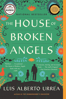
We’re all locked away from our favorite bookstores during the current pandemic, so I haven’t seen the trade-paperback edition of Luis Alberto Urrea’s novel The House of Broken Angels in printed form. But I did see a little thumbnail image of the cover in Moira Macdonald’s recent book column in the Seattle Times. That image didn’t quite have the effect it was meant to have: I burst out laughing the moment I saw it.
The symmetrical arrangement of the principal words of the title, and the small size of the ancillary words, turns the title into what appears to be a stack of three words. And the tiny “OF” next to “HOUSE,” at this size, can easily be mistaken for a hyphen.
So you end up with “THE HOUSE-BROKEN ANGELS.” Which would no doubt be a very different book.
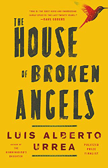
The paperback cover looks just fine at full size, as it would if you saw it displayed on a table in a bookstore. And the very different design of the hardcover jacket isn’t so symmetrical, which makes it less prone to this kind of misreading.
I’m not showing this to make fun of the book-cover design. I’m using it to point out how important it is for a cover designer to look at their design in all the contexts it may be seen in, including at Lilliputian size on a newspaper page or on a website on someone’s phone. How can it be misread? If it can be, it will be.
[Images: trade-paperback cover (top) and hardcover jacket (bottom) of Luis Alberto Urrea’s The House of Broken Angels]