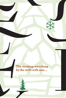
The visual concept behind Hanging by a serif came from something I was playing with for our 2012–2013 holiday card. “The stockings were hung by the serifs with care…” read the front of the card; inside, the text continued, “…in hopes that typographers soon would be there.” On the front, a wild cacophony of huge serifs barged in from the outer edges, with little green Christmas-tree ornaments appended to a couple of them. The background was a pale-green image of a potted conifer, drawn in stained-glass-style, taken from an image-based “Design Font” that Phill Grimshaw had designed in the 1990s for ITC. (The inside also featured a pale background image from the same font, this time of a wrapped package.) It was fun, though I wondered what our non-typographer friends and family would make of it when we sent it out.
Later that year, I began experimenting with the concept, juxtaposing short snippets of text from my own writing with big details from various serifs. I found that I had a lot of statements or fragments on the subject of design that seemed to fit into this format. Eventually, these epigrams and serifs took the form of the first edition of the book Hanging by a serif.
That first edition caught the eye of Bertram Schmidt-Friderichs, whose Mainz-based company, Hermann Schmidt Verlag, has published so many excellent books on typography and design. Bertram wanted to do a German edition of my little booklet, which would be a nice calling card for his publishing program and might even sell a lot of copies. (It didn’t.)
Bertram’s approach to publishing is thorough, and he wanted to include notes about which typefaces all the serifs had come from. This sent me back down the rabbit hole into my own production process, since I had been working with truncated images for most of the design of the book, and I hadn’t kept very careful track of what typefaces my serifs had originally been attached to. It took quite a bit of retrospective detective work to find all my sources. (Hint: a couple of the images had been reversed.) In this sense, the German edition is more thorough than mine. It also has a couple of serifs or serif-like glyphs that are different from the ones I used.
But one of the epigrams bothered Bertram: “Most graphic designers never get more than rudimentary training in typography.” While true, this struck him as too negative, and he suggested coming up with a replacement. In the end, we went with a statement in German that translated as, “Typography is never an end in itself, it targets the eye of the beholder.” (Probably pithier in German.)
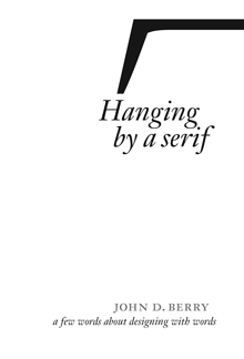
When it came time to do a new English edition of the book (since I was running out of copies of the original), I decided to make two changes. The serif I had used on the cover of the first edition was taken from Justin Howes’s ITC Founder’s Caslon, a digital reproduction of William Caslon’s original types in which Justin attempted to re-create the exact effect of the metal type printed on hand-made 18th-century paper. The outline, therefore, was rough. This roughness around the edges bothered a number of people, some of whom asked me if perhaps the image had been printed at too low a resolution. It hadn’t; this was precisely the effect that the typeface was designed to have, but blown up to extra-large size like this, it was distracting. So for the new edition I searched out a new serif that would work well on the cover. (The serif I chose is from Matthew Carter’s newly released type family for Morisawa, Role.)
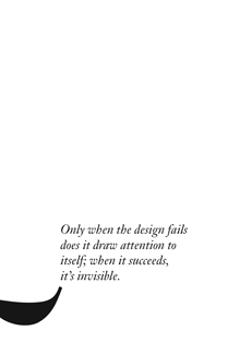
And I did replace the problematic epigram that had bothered Bertram Schmidt-Friderichs, though not with the one we used in the German edition. As I had mentioned once in this blog, a quip of mine had been making the rounds of social media for some time, being quoted repeatedly out of context, and I thought it really belonged in this compendium. So if you turn to page 16 of the new edition, you’ll find this: “Only when the design fails does it draw attention to itself; when it succeeds, it’s invisible.” It really wanted to hang with the other serifs, and now it does.