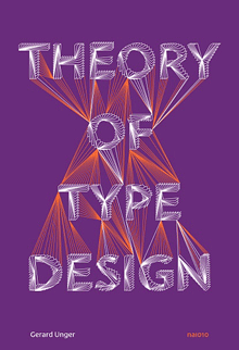
I recently finished reading Gerard Unger’s final book, Theory of Type Design, which I bought at the ATypI conference in Antwerp last September and which Gerard signed at the book-launch event there. It was the last time I saw him, as he died of cancer only a couple of months later.
It took me quite a while to read through Theory, not because it’s at all difficult but because each time I finished a chapter, I wanted to put the book aside and savor what I had just read. It is not, after all, a book with a plot, like a novel; it is, however, a book with a theme and a clear development of that theme.
What Gerard Unger does in this book is nothing less than provide a comprehensive look at every aspect of the design of type, from its origins to the ways we design, read, and design with digital type today on a multitude of screens. Unger always thought about type systematically and observantly, looking for the connections and common elements that bind together such a disparate and unruly history. He was himself a consummate type designer, and a famously thoughtful and helpful teacher. You can hear his voice on every page.
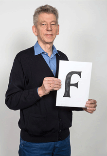
Although his range as a designer was wide, you can often tell a Gerard Unger typeface at a glance; they have a commonality of approach and feel that transcends individual style. One element that I’ve noticed for many years is the way he would pare away what isn’t necessary, including connections within letters: he explored how much you could delete while keeping a typeface happily readable – a useful experiment when you design type for unfavorable conditions of printing or screen viewing. In a note (on page 196), he remarks, “The purest forms I have made as a type design are those of Decoder (1992).” Decoder was a purely experimental typeface (based on the shapes in his typeface Amerigo) issued as an early part of the FUSE project, to see what people would make of the detached yet recognizable parts of Latin letters.
I had hoped to have a chance to interview Gerard for the history of ATypI that I’m working on, since he had been closely involved for many years, but his deteriorating health made that impossible. Despite this, amazingly, he took the trouble after the conference to write me a short note, to let me know that he wouldn’t be able to help after all. That’s the kind of person Gerard Unger was.