function jdb_page_navigation()
sPageSlug = blog
sPageTitle = easily amused
header:139:aPageArgs:page_title = easily amused
header:140:aPageArgs:section_title =
functions-johndberry:262:aPageArgs:page_title = easily amused
functions-johndberry:298:sPageTitle = easily amused
functions-johndberry:359:sPageTitle = easilyamused

easilyamused |

Archive for 2016

Typography of the future: variable fonts

Published

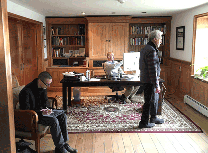
I’ve just finally watched the Special OpenType session, ATypI 2016 Warsaw of the “Special OpenType Session” from the ATypI 2016 Warsaw in Warsaw in September. (Because of scheduling and flight conflicts, I didn’t arrive in Warsaw until the evening of that day, so I missed the live event. Not surprisingly, it was the talk of the town among attendees at the conference.) The discussion in the video is highly technical, but the upshot of this development is exciting.

Variable fonts” seems to be the name that everyone’s adopting for this new extension of the OpenType font format. What it means is that an entire range of variations to a basic type design can be contained in a single font: all the various styles from Extra Light to Extra Bold, for instance, and from Compressed to Extended. Instead of a super-family of separate font files, you can have one font that, conceivably, contains them all.

The presentation had representatives from Adobe, Microsoft, Apple, and Google, reflecting the fact that this is truly a cooperative effort. All four major companies (and several smaller ones) have committed to supporting and implementing this new standard. That’s a very important fact: usually, adventurous people come up with an ambitious new spec for wonderful typographic features, but the problems arrive when the developers of operating systems and applications don’t fully commit to supporting them. This time, from the very first, the companies that develop those apps and OSes are committed.

What that means is that, if it’s implemented properly, the new format will make it possible for font developers to create fonts that adapt to changing circumstances. For instance, in a responsive web layout, you might change the width of the text font as the width of the window gets narrower or wider. You could also change the weight subtly when the screen colors are reversed. These small, almost unnoticeable, but very important variations could make reading onscreen much more comfortable and natural.

This is a watershed. What it reminds me of is two different nodal points in the development of digital type: multiple master fonts, and web fonts. The introduction of variable fonts at this year’s ATypI conference has the same “Aha!” and “At last!” feeling that the introduction of the WOFF font format standard for web fonts had at Typ09, the 2009 ATypI conference in Mexico City. Both events mark the coming-together of a lot of effort and intelligent work to make a standard that can move the typographic world forward.

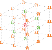
The history of multiple master fonts is sadder, and it points up the pitfalls of creating a good idea without getting buy-in from all the people who have to support it. The multiple-master font format was a breakthrough in digital type; with its flexible axes of variable designs, it made possible a nearly infinite variation along any of those design axes: a weight axis, a width axis, or (most promising of all) an optical-size axis, where the subtleties of the design would change slightly to be appropriate to different sizes of type.

But the multiple master technology, developed by Adobe, never made it into everyday use. The various Adobe application teams didn’t adopt it in any consistent or enthusiastic way, and it wasn’t adopted by other companies either. Instead of being incorporated into the default settings of users’ applications, giving them the best version of a font for each particular use, multiple master was relegated to the realm of “high-end typographers,” the experts who would know how to put it to use in airy, refined typographic projects. That’s not the way it should have worked; it should have been made part of the default behavior of fonts in every application. (Of course, users should have had controls available if they wanted to change the defaults or even turn it off; but the defaults should have been set to give users the very best, most appropriate typographic effects, since most users never make any changes to the defaults at all. It’s important to make the defaults as good as possible.)

Now it sounds like the new variable-fonts technology is going to be incorporated into the operating systems and the commonly used applications. If this really happens, it will improve typography at the everyday, ordinary, pragmatic level. And what that means is the improvement of communication.

I’m looking forward to seeing how this works in practice. And to putting it to use myself, and helping in any I can to improve and implement these new standards.

[Images: (left, top) Peter Constable speaking at the Special OpenType Session at ATypI Warsaw, September 2016; (left) schematic of the design variations of Adobe’s Kepler, designed by Robert Slimbach.]

Return to Martha’s Vineyard

Published

In May, I had a chance to revisit my childhood home – on a business trip.

Although I was born and raised in Bronxville, New York, a close-in suburb of New York City, my family spent all of our summers in Edgartown, Mass., on the island of Martha’s Vineyard. My parents had met first there in the 1930s, and they are both buried in the Edgartown cemetery. They would have retired there, if my father hadn’t had a fatal heart attack at the age of 56.

So I always had two homes, like a migratory nomad herding the sheep from winter to summer pastures. Though without the sheep; maybe a cat or two, some years.

But I never expected to be returning to the island on typographic business. I’ve been working since last year as managing editor for Font Bureau, which has been technically based at its office in Boston but which is run by Sam and David Berlow, who both live on the Vineyard and have done so for many years. So that’s the location of Font Bureau’s annual “offsite,” and this year I was a participant.

Type Network office

Around the two days of meeting and eating and talking type, I also found a little time to reacquaint myself with the island, and to meet up with one of my oldest friends. Sara Piazza and I have known each other since we were little children living two houses apart, best summertime friends from the age of five. (Admittedly we’ve let many years go by between contacts as adults. Facebook has been useful in renewing our connection. As is its wont.) Walking down Main Street to the Edgartown waterfront with Sara, who knows everyone on the street, and stopping to talk to many of them, felt to me like coming home, even though I was a stranger to them. (Well, no, I was a friend of Sara’s, so I wasn’t a stranger. And when I mentioned to Sam Berlow who it was I was going to see, he said, “Oh, Sara! Of course I know Sara.” It’s a small island.)

I had caught a ride from Boston down to Woods Hole with Roger Black and his husband Foster Barnes, and while we were waiting for our ferry we had lunch at a local seafood restaurant (what else?) and walked around the town a bit. I had never explored much more of Woods Hole than the area near the ferry dock, but we discovered a pleasant little New England seaside town with more, and bigger, scientific institutions than I had realized, as well as a peculiar semi-medieval bell tower overlooking the lagoon.

This Font Bureau offsite was retroactively declared the first offsite of Type Network, the new expanded type-distribution business that launched on June 1. I now have expanded responsibility, too, as managing editor for a complex of type foundries. We anticipate that the Type Network website will have a lot of new content in the coming months, so there’s work to be done. Check it out.

Falmouth Station lettering

[Photos: (top, above) the new Font Bureau/Type Network office in Vineyard Haven (L–R: Cyrus Highsmith, Sam Berlow, Richard Lipton); (immediately above) lettering on the old Falmouth station (now a bus stop on the route from Boston); (left, top to bottom) Edgartown harbor; bell tower in Woods Hole; Roger Black and Foster Barnes in Woods Hole.]

[A year and a quarter later, the Falmouth bus station’s lettering had been spiffed up and updated.]

Falmouth-Station-new-lettering

More writing

Published

I have just added a couple of complete essays to the rather minimalist “Writing” page on this site, and links to several others.

That page has so far consisted of short, and I hope intriguing, excerpts from various longer pieces of my writing. Now I’ve added links to almost all of the originals, making this a sort of landing page or entry point to these essays.

I’ve added the introduction to Contemporary newspaper design (2004), where I attempted to look at the development of newspaper typography over several technological and economic revolutions, and “The Business of Type”, my account of the origins, development, and demise of U&lc, which was the introduction to U&lc: influencing typography & design (2005). Both of these were books that I edited for Mark Batty Publisher; both of them are now out of print. I think those essays are worth making available again.

I’ve added some more links, too. Check ’em out.

[Update, April 15, 2016:] I’ve now added the missing piece, the preface to Language Culture Type. It is a less substantive piece than the others, but still worth having intact.

Acumin & Bickham Script

Published

Now that’s an unusual pair of typefaces to mention together. But both the new Acumin family and the enlarged and updated Bickham Script Pro 3 have been released recently as part of the Adobe Originals program, and I wrote most of the background material on both of them. These were both projects that were a long time in development, so I’m pleased to see my own descriptive work in “print” at last.

Acumin & Bickham Script Pro 3 together

For Acumin, Robert Slimbach’s extensive neo-grotesque type family, I dug into the history of sans-serifs, trying to nail down exactly what makes one a “grotesque” or a “neo-grotesque,” and where the term came from. It was a great pleasure researching images, especially from the 19th century, in the collection of the Letterform Archive in San Francisco. I think we ended up showing more images of old sans-serif type than was strictly required, just because they looked so cool.

Most of my research on the history of the 18th-century English writing style known as “round hand” and George Bickham’s compendium of examples, The Universal Penman, was done at the Seattle Public Library or online, but at the Letterform Archive I also got to see Bickham’s rare earlier book, Penmanship In It’s [sic] Utmost Extent.

The Acumin website is a highly responsive one, coded by Nick Sherman; the Bickham site is more in the mold of Typekit’s usual sites, though it too consists of several parts.

[Images (left, top to bottom): from the Acumin site; Bickham Script Pro 3 illustration; a few 19th-century grotesque typefaces. Above: combining two very different type styles.]

t for 2

Published

You don’t get wonderful bound specimen books from type foundries very often these days. Digital foundries tend to produce digital specimens, for all the obvious reasons. But a few days ago The Terminal Design Type Catalog arrived in my (physical) mailbox, and I was delighted.

James Montalbano, the Chief Cook and Bottle-Washer of Terminal Design, has been designing extensive, carefully coordinated type families for twenty-five years. “Ever since my days as a magazine art director,” he writes in his brief Preface, “I have both loved and been disappointed by type. I loved mixing, arranging and discovering different type designs, but was always disappointed by the lack of weights and widths of most designs.” That disappointment will not await anyone browsing this catalog.

This a well-made, well-bound hardcover book, designed by Charles Nix. The embossed red t that takes up the whole cover is striking and dramatic. Each type family is given several pages, with a display of the full character set and large one-line showings. For text faces, there are also pairs of sample text pages with the type shown at different sizes and sometimes different weights.

Terminal Design catalog text spread

The display faces don’t require extensive text settings, but they’re shown off in dramatic form. My favorite page in the whole book must be the final page for the 20-weight typeface Yo.

Terminal Design catalog display spread

The back matter shows sample pairings of display and text faces, comparison of x-heights, the variations in OpenType stylistic sets, and, most notable of all, a visual index of “earmarks,” the distinguishing features of glyphs from different typefaces.

Terminal Design catalog earmarks

James Montalbano’s typefaces are always thoroughly considered, cleanly designed, and well produced. His squarish text face Choice Sans, with multiple widths, gives a lovely, modern texture to both text and display. The sharply serifed Consul takes high-contrast Didot style and freshens it, with six weights and four optical sizes, in both roman and italic. Even the wonderfully weird Fervent, with its pitchfork e and its double-wide w, looks assured and solid on the page.

There are two things that bother me in this catalog. One is the lack of any descriptions of the various typefaces: each one has a careful list of all its features, but there’s no hint of its history and nature, or of how its designer thinks about it.

The other thing is a choice: in the text samples, facing pages of the same typeface at different sizes have the same amount of added leading (3 points). The effect of that is to give the text blocks of smaller type looser line spacing than the text blocks of larger type. That makes it harder to compare them usefully.