function jdb_page_navigation()
sPageSlug = blog
sPageTitle = easily amused
header:139:aPageArgs:page_title = easily amused
header:140:aPageArgs:section_title =
functions-johndberry:262:aPageArgs:page_title = easily amused
functions-johndberry:298:sPageTitle = easily amused
functions-johndberry:359:sPageTitle = easilyamused

easilyamused |

Archive for September, 2015

Eyemag

Published

I just got the latest issue of Dennis Letbetter’s Eyemag, his more or less quarterly series of magazine-size books that showcase different aspects of his long and notable career as a photographer. (I’m not sure I can say “long career” about someone who’s younger than I am, but what the hell. He’s been doing it for a long time. And it’s certainly notable.)

These are printed privately and distributed to a very limited circulation, but after some prodding Dennis did allow as how he would welcome subscriptions. I believe the rate for four issues is $200, but you should check with him. It might be worth your while. Meanwhile, you can view the contents of individual issues on the website.

Dennis’s photography is remarkable. It’s not showy; it’s just good. The one thing that might be considered an affectation is his occasional use of an extremely wide aspect ratio (6x17cm): but he puts it to good use. The current issue, no. 8, uses these long, narrow apertures to document the city of Florence. The first half of the images is vertical, like some of the narrow streets, while the second half is horizontal, as our eyes tend to see a streetscape.

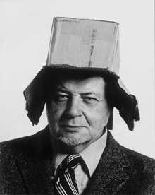
The previous issue documented a full year of daily portraits of his friend and mentor René Fontaine. “Who would submit to portraiture, let alone a serial portrait which requires an involvement of a year?” asks Dennis in his thoughtful essay at the end of the volume. But René did: he sat for 365 portrait photographs, from from the summer of 1980 to the summer of 1981, no matter how he was feeling, what he was doing, or what the rest of the day might hold. And Dennis was there to record it. Occasionally René would don a whimsical hat (the portrait on the left has always been a favorite of mine, even before I knew its context), but mostly he just sat down in his everyday garb and looked patiently at the camera.

What might be the most unusual issue of Eyemag is no. 4, “The Haight Street Project.” During the same period when Dennis was shooting portraits of designers and artists in the San Francisco Bay Area using a big old-fashioned camera with glass plates, he was also inviting his neighbors in the upper Haight into his garage, which he had converted into a studio, to take their portraits on 4×5 color film in a thoroughly informal situation. These photos let the people who live in or pass through the Haight show themselves however they wish.

Each issue of Eyemag ends with an essay by someone notable and appropriate, and one by Dennis himself. In the current issue, the essay, “Eye Level” (in Italian, with an English translation), is by Andrea Ponsi. In the Haight Street Project issue, the guest essay is by Herbert Gold.

The striking “i” logo of Eyemag was designed for Dennis by the late Michael Harvey, a good friend and an amazing artist in the creation of letters. That i is recognizable as a Michael Harvey letter from a mile away.

(Note: Yes, it can be confusing, but Eyemag is entirely different from the excellent Eye magazine.)

[Images (top to bottom): Covers of issues 1, 6, and 8, and portrait of René Fontaine, 21 March 1981. All images copyright by Dennis Letbetter.]

The Letterform Archive

Published

I recently had my first chance to visit the remarkable Letterform Archive in San Francisco. This is the fruit of thirty-five years of collecting by Rob Saunders, all of it related to type and lettering and printing – especially type specimens and printer’s samples, along with books, manuscripts, and all kinds of printed and hand-made ephemera. In 2013, Rob turned his private obsession into an institution and established the Letterform Archive as a formal entity. More recently, as he announced last month at TypeCon, he acquired the enormous collection of the late Dutch bibliophile Jan Tholenaar, consisting of thousands of type specimens from the last 400 years.

The purpose of the Letterform Archive is to make original research materials available to people for hands-on study: so you can not just look at them but pick them up and hold them in your hands. There are larger collections than his, as Rob freely admits; but too many of them are closed to the public and not easily accessible. With the Letterform Archive, Rob hopes to provide a resource to students, researchers, type historians, graphic designers, and anyone interested in the history of letters. It’s easy to arrange a visit; the space is bright and welcoming, and so are the people.

The other initiative that Rob announced at TypeCon is a new program in conjunction with Cooper Union: Type@Cooper West. This will be a West Coast equivalent of Type@Cooper, the post-graduate program in type design that Cooper Union has been offering for several years at its campus in New York City.

Rob has a few other ambitious plans in mind, too. I’m delighted to see such an energetic undertaking. And I can say from personal experience that it’s a pleasure to sit in the Archive and peruse type in all its many forms.

The ATF Collection

Published

Just in time for this year’s TypeCon, the new digital ATF Collection arrived on the typographic scene. This is a remarkably broad range of typefaces and type families based on the metal typefaces issued by the American Type Founders Company from the late 19th century to the middle of the 20th. (These were not “hot metal”; that refers to type that was cast on a machine, such as a Linotype or a Monotype caster. ATF was a consolidation of the many American type foundries that manufactured type for hand-setting, in foundry metal. The metal was “hot” when it was first cast, but not when it was being set.) ATF was responsible for many of the best-known American typefaces of the 20th century, both original designs and revivals of classic European types. This release features a wide variety of sans-serif display faces, plus a classic text & display family and a funky brush-written display face.

I had the pleasure of writing most of the descriptions of the typefaces in the collection, as well as the background on ATF. (Stephen Coles wrote the copy for the peculiar ATF Wedding Gothic and a very amusing riff on the quirky yet familiar ATF Brush.) The new typefaces reference ATF’s original designs, but extend them into larger and more fully usable families. Many of the faces in the ATF Collection are sans display faces that we’ve been seeing, in one form or another, for most of our typographic lives.

The mind behind the ATF Collection is Mark van Bronkhorst, director of TypoBrand and founder of the respected digital type foundry MVB Fonts. (I’ve been using his MVB Verdigris as my go-to book text face for many years.) Mark is unusual among type designers for being both a talented and respectful designer of type and a very thoughtful and creative user of type, a typographer. I had ample experience of this when I was editing U&lc and Mark was the designer of the magazine.

Since the début of the ATF Collection a few weeks ago, a number of people have asked me about the back story, especially how Mark got the rights to the ATF name. The answer turns out to be remarkably simple,

“The ATF and American Type Founders trademarks were abandoned many years ago,” Mark told me. The old trademarks had expired by 1996; no one had renewed them, and in any case, “ATF had never been registered for use with digital fonts.” Mark discovered further that “it also appears that ‘American Type Founders’ has never been registered, and, except for our use, no other company appears to be registered as doing business under that name.” So, legally, the name was available for use.

“We started using the ATF and American Type Founders names and filed trademark applications for them in commerce seven years ago,” says Mark, “by releasing an ATF Franklin Gothic as a single digital font on fonthaus.com. (Technically, we had actually started using the ‘ATF’ trademark much earlier.) The USPTO after a diligent examination accepted and issued trademark registrations to TypoBrand for use of the trademarks with our digital ATF fonts. Our registrations have been live for seven years now.”

That’s the story behind the question of who now owns the ATF name (at least the short version). The point is that Mark and TypoBrand were very careful not to step on any toes, legally or ethically, in bringing these type designs back onto the market.

“Stated briefly,” says Mark, “I felt it was high time that the designs formerly associated with ATF see new life in digital form and that such an effort be branded accordingly as a collection, paying tribute to their legacy.” That is exactly what he is doing with the new ATF Collection. “It is my intent to honor the body of work that deserves a place in the digital community.” Mark adds that this is an ongoing effort, and that he’d love to see participation from other interested type designers.

It’s been fun working on this project, and seeing the typefaces take their present form. Reviving and expanding hundred-year-old metal typefaces involves a lot of careful work – not just adapting to a new medium and new technology but extending character sets far beyond what anyone was expecting back in the hand-setting days. I’m looking forward to seeing how people put these newly available fonts to use.

FontCasting

Published

During last year’s TypeCon in Washington DC, FontShop’s David Sudweeks videotaped interviews with a number of type designers, and with at least one non-type-designer: me. He asked questions about how I’d gotten started in the field of typography (“sideways”) and about book design, which gave me an opportunity to set out my ideas about the typography of onscreen reading, and the nascent Scripta Typographic Institute. (That’s a subject that I’ll be taking up again at ATypI 2015 in São Paulo next month.)

Now that interview has been published. The parts about book design & e-book design start at 1:25, after some introductory material.

All of the FontCast interviews are short, focused, and well edited.