While I was relaxing in one of the comfy chairs in Typekit’s temporary Pop-Up Library, at TYPO SF in San Francisco last spring, I spotted a small booklet that I had never seen, displayed on the shelf. It was one of the series of booklets produced in the 1960s by the Canadian typographer Carl Dair for West Virginia Pulp and Paper (Westvaco), “A Typographic Quest,” each one of which covered a particular aspect of typography. These little booklets are among the best guides to the basics of typography that you can find; Carl was a master of explaining by showing, and his book Design With Type is justifiably renowned for its clarity and usefulness, despite being by now hopelessly outdated in terms of typesetting technology. (The principles don’t change, only the means.)
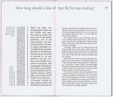
The book I spotted was A Typographic Quest Number Three, subtitled type to be read; it was the only one of the series that I had never been able to find in my bookstore spelunking. As it talks about exactly what fascinates me in typography – making a page or paragraph of text easy to read – I had kept looking for a copy, but the last time I had checked, the only copy available was fabulously expensive. I resisted the illicit urge to slip Typekit’s copy into my pocket and spirit it off, but I did come away from the conference with a renewed impetus to seek out a copy of my own.
Which, of course, turned out to be available from several sources, and not at ruinous prices; my earlier searches must have been conducted at infelicitous times. At any rate, I now have my own copy of the excellent Number Three in Carl Dair’s series, complete with its own plastic-coated insert, the “Alphacast,” which is a handy tool for “casting off,” or “estimating how much space a typewritten manuscript will occupy when set in any given size and style of type.” Tools like this are pretty much unneeded these days, when we set type digitally and can simply apply the relevant type size and style to the text and see exactly how much space it takes up, but in the days of handset type or hot machine-set metal, there was no easy way to do this.
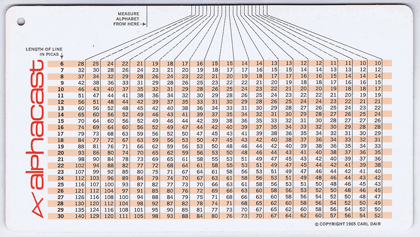
In the sort of detail typical of Dair’s work, his Alphacast even deals with the variance created by texts that are full of narrow letters (illicit still) versus those full of wide ones (mammal); the typewritten copy would treat all letters the same, since typewriters typically use fixed-width alphabets, but typeset copy is almost always set in a font with variable widths.
Now the set of A Typographic Quest on my bookshelf will be complete.