function jdb_page_navigation()
sPageSlug = blog
sPageTitle = easily amused
header:139:aPageArgs:page_title = easily amused
header:140:aPageArgs:section_title =
functions-johndberry:262:aPageArgs:page_title = easily amused
functions-johndberry:298:sPageTitle = easily amused
functions-johndberry:359:sPageTitle = easilyamused

easilyamused |

Archive for 2013

Questionable practices

Published

Many of you know that I live with an author: my partner and wife Eileen Gunn is a well-respected short story writer, whose first collection, Stable Strategies and Others, was published in 2004 by Tachyon Publications. Not surprisingly, I designed and typeset that book (and ended up doing a good bit of design for Tachyon, sometimes covers, sometimes interiors, over several years). We also developed a visual identity for the book and its marketing campaign – a necessity in today’s publishing world – where I had fun putting the incendiary cover image to work in other contexts.

EileenGunn.com

Now I’ve designed her second collection, Questionable Practices, which will be out in April from Small Beer Press. The interior text design echoes the earlier book, but we gave this one a distinctly different cover design – though one that I think will sit comfortably on a bookshelf next to Stable Strategies. The publisher has just sent out ARCs (Advance Reading Copies) to reviewers.

The cover for Questionable Practices went through three entirely different versions, as these things often do (not counting the innumerable iterations of each still lurking on my hard drive). It’s in the nature of commercial book publishing that the publisher needs a cover image, for publicity and marketing purposes, long before they need a finished book; indeed, often enough the text isn’t finalized until long after a cover image has been widely distributed. When I was working as a typographer at Microsoft Press in the mid-1980s, we used to get outside “designs” from a local studio that simply provided cover sketches and sample pages with typical interior design elements; these were done long before the book was even written. Not only did we have to execute the final covers, but we often had to invent designs for new interior elements that came along as the books were written and edited. Eventually, since we were doing half the design work anyway, we took the interior design in-house.

Eileen’s stories don’t fit into obvious categories; they’ve almost all been published as science fiction, but she refuses to ever repeat herself, and her work rejects easy classification. When I designed the cover for her first collection, I was trying to do something that would stand out both on the general-fiction table and in the science-fiction section of a bookstore. As I discovered, though, few bookstores were willing to shelve copies of the same book in two different sections; it was always one or the other. Today, with online marketing and bookselling, perhaps it’s easier to place a book in multiple categories at the same time. In any case, today a book cover needs to be clear and work well as a little thumbnail image, not just at full size on the physical book.

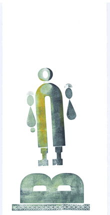
Naturally, each of the three cover versions for Eileen’s book seemed perfect to me at the time, but in the end the one you see at the left worked best – and will be on the book. As a completely objective and nonpartisan observer, I can say: watch for it.

[Update, Jan. 16: I just sent the book to the printer today. Publication date: March. Typeface: Dolly Pro.]

Structured writing for the web

Published

At the end of June, at the Ampersand conference in Brighton, Gerry Leonidas gave a shout-out to an early version of the prospectus for Scripta (“Typographic Think Tank”) in his talk. I had somehow missed this until Tim Brown mentioned it in an e-mail recently inquiring about Scripta. I can highly recommend Gerry’s talk, and not only because he quotes me (7:07–7:49 in the video). Although he starts out with a disclaimer that “this is a new talk” and he’s not sure how well it will hang together, in fact it’s extremely coherent; Gerry is both articulate and thoughtful about the wide range of questions (and, rarely, answers) involved in typography on the web.

Gerry used my “wish list” from “Unbound Pages” (in The Magazine last March) as a jumping-off point for his own ideas about the structure of documents and the tools that he wants to see available. He wants tools for writers, not just for designers, that will make it easy to create a well-structured digital document, one that will maintain its integrity when it gets moved from one format to another (as always happens today in electronic publishing). Gerry’s own wish list begins at 20:47 in the video, though you won’t want to skip the entertaining steps by which he gets there.

What he proposes is a way to separate the sequence of information from its relative importance and interrelatedness. “This is what I really want: I want someone to go out there and take Markdown, which I use constantly, and take it from something that clearly has been written to deal with streams of stuff with some bits thrown on the side … and allow me to have this extra intelligence in the content – while I’m writing it – that will tell me how important something is, what sequence it has with other things, and will then allow me to ditch quite a lot of this stuff that is happening there.” The “stuff” he wants to ditch is all the hand-crafted formatting and positioning that makes a digital document cumbersome and difficult to translate from one form to another.

The problem is, as Gerry admits, training people to write with structure in mind. (Every editorial designer who has tried to get writers to use paragraph and character styles will break out into a hollow laugh at this point.) What he’s advocating is tools that will make this easy to do, instead of something that only makes sense to experts. I think he was a little disappointed that nobody leapt up at the end of his talk to say, “We’ve already done that!” But perhaps he has planted the seed.

A brace of book launches

Published

I’ve been to two very well attended book launches in Seattle this week – both them within walking distance of my home. The first was for Nicola Griffith’s new novel Hild, at Richard Hugo House on Wednesday; the second, last night, was for Judith Gille’s self-published memoir, The View from Casa Chepitos: A Journey Beyond the Border, at the Elliott Bay Book Company. It was gratifying to see both venues packed.

Nicola’s book I have no connection with other than knowing and admiring Nicola and looking forward to reading each of her novels. Judith’s book I do have a connection with: I designed and typeset the interior. (I had nothing to do with the flamboyant and effective cover, which was designed by Dorit Ely.)

I got to use Mark van Bronkhorst’s recently released OpenType Pro version of MVB Verdigris, which was completely appropriate to the visual feel that Judith wanted for her book. I even got to confront the interesting problem of how to treat a chapter opening with a drop cap, when the first word is the beginning of a quote in Spanish, requiring not only opening quotation marks but an opening inverted exclamation point as well. I could have finessed the problem by de-emphasizing the punctuation marks somehow, but in the end we decided that it worked with some judicious spacing and fiddling around. (Oh, yes: our chapter-opening convention also included small caps for the first several words, which in this case required italic small caps. Happily, Verdigris Pro includes them.)

Chapter opening from 'The View from Casa Chepitos'

I’ve already read and enjoyed Judith’s memoir, a thoughtful and empathic account of becoming a part-time resident of San Miguel de Allende, Mexico. Now I’m enjoying Nicola’s lively historical novel, in which she creates a believable milieu and a strong character for the 6th-century Anglo-Saxon abbess, Hild of Whitby.

One thing that both books have in common is strong women – including the authors.

In Amsterdam

Published

The ATypI conference in Amsterdam last week was my last one as President of ATypI.

After six years as president, I was stepping down, and at Sunday’s annual general meeting the membership elected José Scaglione as the new president of ATypI. I will remain on the Board, and I expect to be actively involved with ATypI for years to come, but I’m looking forward to attending next year’s conference in Barcelona as a civilian.

I’m pleased with what we’ve done with ATypI in the past six years (and it was by no means just my doing; it was a collective effort). I’m especially pleased with how we have visibly expanded the organization’s reach beyond its heartland in western Europe, staging conferences in St. Petersburg, Mexico City, Reykjavík, and Hong Kong, and taking the design of non-Latin typefaces from a marginal sideshow to a central part of the programming at each ATypI conference, no matter where it’s held. ATypI may have begun fifty-odd years ago as an industrial trade group, but today its most important function is educational. At a time when type, type design, and typography are in the hands of everyone with a computer, there’s more need than ever for an explanation of the history, the standards, and the future possibilities of type.

Which leads directly into my own talk on Sunday morning, just before the lunch break on the conference’s final day. I spoke about design for the onscreen page (something that anyone who has followed this blog knows that I’ve written and spoken about many times over the past two years), and I launched a new initiative: the Scripta Typographic Institute, a think tank and advocate for excellence in digital typography and the development of new tools for text typography on screens of every kind. At this point, it’s all about intentions; but by making it public at ATypI I meant to turn it into a real organization, with participation by many more than just myself. If it works the way I hope, Scripta will become a nexus for the development of new ideas and new ways of thinking about reading, and thus about designing for reading, onscreen.

John D. Berry talk: The onscreen page

Between my duties as ATypI president and my preparations for the launch of Scripta, I had very little time to enjoy being in Amsterdam. But I had an unexpected companion: thanks to the machinations of Barbara Jarzyna, ATypI’s executive director, and Thomas Phinney, our treasurer, with the connivance of the rest of the board of directors, my partner Eileen Gunn found her way paid to Amsterdam to join me; and we did manage to have a day or so of plain exploration before the conference itself drew us in.

And on Saturday night, at the gala dinner, after the main event – the presentation of the Dr. Peter Karow Award to Donald Knuth – Tom Phinney grabbed me and said, “No, wait, you’re not done yet.” He then gave a short, moving speech to thank me (and embarrass me), handing me a most wonderful keepsake: a metal composing stick full of hand-set type, locked in place, with an inscription (if that’s the right word) that I had to read backwards and upside-down.* I can assure you that it beat the hell out of a gold watch (or any kind of certificate that could have been printed from the locked-up type). I felt honored.

John D. Berry & Thomas Phinney share a laugh

Commemorative stick full of type

That was only a minor part of this year’s ATypI conference, which featured two keynote addresses (by Alice Rawsthorn and Petr van Blokland), each of which presented different perspectives on the nature of design; three awards presentations (the TDC medal to Gerrit Noordzij, the Karow award to Donald Knuth, and, as the closing event of the conference, the Prix Charles Peignot to Alexandra Korolkova); and innumerable excellent talks and presentations by a wide variety of typographers, type designers, educators, and generally inspired people. We had the largest attendance since Mexico City in 2009, and as far as I can tell everyone regarded it as a successful and enjoyable conference.

There was a certain fittingness to ending my term as president in Amsterdam. The last time I had been in the city was in 1990, right after my very first type conference, Type90 in Oxford. At that time I was a rank neophyte, at least in the type world; today I’m at risk of becoming one of the old guard. (That still seems a little weird.) What has changed more than anything else in that time is that type is now in everyone’s hands; the need for understanding it is much greater, and much more widespread, than it has ever been before. Which, of course, offers us a truly wonderful opportunity.

[Images: photos by the ubiquitous Henrique Nardi of me opening the conference (top left), talking about the onscreen page (above), and with Thomas Phinney (also above); my own snapshots of Donald Knuth with Barbara Jarzyna (above left), of Alice Rawsthorn giving her keynote talk (above left, bottom), and of the composing stick full of type that was given to me (above).]

[*Oh, all right. The inscription reads: “Association Typographique Internationale | John D. Berry | President 2007–2013 | In appreciation of your tangible and significant | contributions to typography and graphic design.”]

At last: Dolly Pro

Published

One of my favorite book typefaces is finally available as an OpenType font. (More precisely, it’s available as a family of OpenType fonts.) Dolly, designed by the Dutch/Finnish “pan-European design collective” Underware, was released in 2001 as a set of four PostScript fonts: roman, italic, small caps, and bold. It was intended from the first as “a book typeface with flourishes,” as the Underware website has it. I used the original version of Dolly as the text face for Stable Strategies and Others, the first short-story collection by my partner Eileen Gunn (Tachyon Publications, 2004), and I have used it in other books since.

Text in Dolly, from 'Stable Strategies and Others'

But I’ve been hesitant to use it in recent years, simply because I’ve grown accustomed to only using OpenType fonts that incorporate advanced typographic features like small caps, old-style figures, ligatures, and alternate characters in the same font as the standard character set. With an OpenType font like that, you can apply those features within InDesign without altering the flow of the text; that is, the characters in the original text string remain exactly as they were, so reusing or repurposing the text is easy and almost seamless. (I say “almost” because I usually massage the text in a book by forcing line breaks here and there for better readability; if that text is going to be exported or copied for further use, those breaks need to be taken out. Similarly, I often insert a hair space between, say, an italic exclamation point and a roman close-quote, rather than using kerning to fix the spacing; but that might not be useful if the text is being exported for use in an e-book.)

Last spring, Underware finally upgraded their entire type library to OpenType, taking the opportunity to add new ligatures and alternate glyphs, alternate figures, and much wider multilingual Latin-script support to Dolly and many other of their type families. Of course, since no type designer can resist fiddling with the design when given the chance, Dolly has a lot of improvements to individual characters, most of them very slight but still adding up to enough difference that you couldn’t simply apply Dolly Pro to a passage typeset in Dolly and expect not to see some text reflow. But that’s often true of font upgrades; and the original Dolly fonts are still on my system and available if I need them.

Meanwhile, I’ve already used the new Dolly Pro in a book: a self-published memoir by my nephew Mark L Berry, a commercial-airline pilot and the other writer in the family. The book, 17,360 Feet: My Personal Hole in the Sky, is available now as an e-book (not designed by me) and a printed book from Amazon.

Dolly roman is a low-contrast old-style that appears comfortingly traditional at text sizes, although if you look at it closely you realize that it has some very odd angles and curves in the details of the letters; it’s a sort of rounded roman, with asymmetrical serifs and no real straight lines, despite its upright and sturdy demeanor. The italic is downright sinuous, although based on easily recognizable italic forms. There have been a number of type designs since 2001 that echoed Dolly’s characteristics, but none that has surpassed it for sheer usefulness.

[Images: logo from the Underware website page about Dolly Pro (above left); an example of text in Dolly, from Stable Strategies and Others (above).]

TypeCon Port L’ampersand

Published

For last month’s TypeCon in Portland, Oregon (“TypeCon Portl&” as it was dubbed), Jules Faye and I prepared a talk about the work of her late partner Chris Stern, who was an innovative letterpress printer with a particular fondness for sans-serif type. Although he came to typography through learning to set phototype at a local job shop, and later headed up the type department at the fledgling Microsoft Press, Chris taught himself letterpress printing and became an expert in hand-set and hot-metal typesetting. At his death, Chris had been working on a manifesto about the use of sans-serif type in metal, with lots of images both informative and playful and lots of samples of carefully set Monotype and foundry sans-serif type. He never completed this work, but Jules unearthed enough notes and proofs and trial settings that we could weave a narrative around them that we thought would inspire some of the printers and typographers in the audience.

We got to show some of Chris’s meticulously layered typographic compositions, as well as fanciful characters – printed faces and bodies made up entirely of metal type. We also showed some of his serious book work (concentrating on the ones where he used sans-serif), as well as some sample spreads for his unfinished manifesto: juxtaposing sober blocks of sample text with whimsical but pointed illustrations. I even scanned and zoomed in on several pages of Chris’s notes and edits to his own proposed text – but a little of that goes a long way when you’re seeing it projected on a big screen. One passage from his own text that we quoted and showed in a sample setting was his description of the type for the manifesto itself: “Sans Transgression/ This book was going to be 100% sans serif. It seemed only fitting, after all. But along the byways of design, Commercial Script jumped into my path and I couldn’t resist. I feel confident that this will be my only sans transgression. My partner, however, says not to worry because there aren’t any serifs, just swirls.”

Among my favorite images are the multi-color prints of U-Man, an anthropomorphic character whose body is a bold, condensed capital U (sans-serif, of course!) and whose other body parts sometimes changed from one incarnation to the next.

In presenting this material, Jules felt that we were opening up Chris’s unfinished manifesto and giving it a continuing life, whatever form that may take. Nothing is ever finished.

Warning! Adults Only! Product contains letterforms at their most exposed! Viewer Discretion Is Advised. Adults Only: Warning!

On Sunday afternoon, I caught a city bus up to the north end of town for an open house at the C.C. Stern Foundry, which is now the home of much of the printing and type-casting equipment that once filled up the barn at the “printing farm” of Stern & Faye. Many TypeCon attendees made the trek, so there was a lively group of printers, typographers, and interested amateurs. And whoever designed the nametags for the volunteer staff of C.C. Stern put to shame the design of the TypeCon nametags, which (typically) gave pride of place to the logo and kept the name too small to read from across a room.

This was a good TypeCon, full of good conversations and with a number of excellent talks and presentations. Of course Portland is a great city to visit – it’s hipster central, a land of coffee, beer, wine, and food trucks, with a very convenient transit system. The weather even gave us a taste of Northwest drizzle, though it also gave us some un-Northwestern warm humidity. I think pretty much everyone had a good time.

The visual identity for this TypeCon rendered the host city as “Portl&” in a very retro-’80s graphic style. I kept referring to it as “Port L’ampersand” – the little settlement on the Willamette River that grew up to be a real city written with real letters.

Next up on the typographic calendar: ATypI in Amsterdam, October 9–13. See you there?

Hanging by a serif

Published

Recently I published a little booklet called Hanging by a serif: a few words about designing with words. This is the culmination of a project I’ve been working on, off and on, for more than a year: pulling a selection of statements about typography and design from my own writing and presenting them, one to a page, along with a simple decorative element. The hook – quite literally, in some cases – is that those visual elements are all enlarged details of serifs, taken from a wide variety of typefaces. (You’d be surprised how much alike the serifs look on a lot of otherwise distinctive typefaces, when you blow them up in size and cut off the rest of the letter.) I had fun with this, as you might imagine. The hardest part was forcing myself to edit or rewrite my own words, to make them more appropriate to this format and purpose. It was also difficult choosing the quotes, and picking the serifs, but that was the kind of task that you can only revel in: a richness of choice.

One early recipient of a digital version, Scott-Martin Kosofsky, unexpectedly suggested that I “may have invented a new genre, design maxims, making you a kind of typographic Rochefoucauld.” I certainly doubt that my little booklet will go through as many editions and revisions as La Rochefoucauld’s Maximes, but I’ll be happy if it finds a use in the hands of its readers.

For an early draft, which I wanted to take with me on a visit to San Francisco to show to Jack Stauffacher and others at one of his weekly Friday lunches, I had trouble getting the booklet to print properly as page spreads, so I just printed the pages individually and bundled them into a wrap-around folded cover, just to suggest how it might all work as a booklet. What that inadvertant format showed me, however, was that these pages could also work singly, as individual cards. The actual content of those pages has undergone a good bit of revision since that San Francisco trip, but this is the reason why I’m offering Hanging by a serif both as a saddle-stitched booklet and as a set of cards.

When I showed a version of the cards to Juliet Shen at one of our local typographers’ pub gatherings, her immediate thought was, “I could give each of my students one of these and have them do a project based on it.” I hadn’t thought of that; perhaps they have a future use as a teaching tool. (You be the judge.)

This is the “first iteration” of Hanging by a serif; I’m sure it will evolve and appear draped in other clothes. Right now, you can buy the booklet or the cards from the newly created Shop page on this website, and they will undoubtedly be available through other sellers eventually. I sold a few at TypeCon in the SOTA store, and I expect I’ll have at least a few with me at next month’s ATypI conference in Amsterdam. Or you can use PayPal to buy a copy right here, and have me send it to you directly. (If you’re interested in a larger quantity, just send me e-mail at john <at> johndberry <dot> com and let me know.)

iOS7 typography: too thin, too tight

Published

Everything about the new design of iOS that was previewed this week looked nifty, except for the typography. Okay, I’m not wild about the candy colors, but that’s just taste. Typography isn’t just about taste; it’s about functionality. On the screen, and for information design, Helvetica – whether Neue or not – is not functional; it just gives the flavor of functionality. The letterforms are too closed, too uniform; they’re not easy enough to distinguish at a glance. And a glance is exactly what we give to the screen of our phone.

At huge size, the Helvetica Neue Thin numbers look all right; but at any other size, they lack clarity. It’s too easy to mix up a 3 and a 6 and an 8 and a 0, at small sizes – not a problem you really want to have when you’re dealing with dates and coordinates and addresses and phone numbers.

Please, can we have a moratorium on very thin sans-serif type that’s pushed tightly together? Trying to squeeze more information into a small space is useless if the information isn’t clearly readable. The lighter the weight of a typeface, the more space it needs between letters, to be easy to read. And it needs even more space when the text is displayed against a dark or mottled background, or seen at an angle rather than straight on. All of which is inherent in the iOS7 design.

For that matter, I wonder whether, in the age of Apple’s Retina display, there’s any need to stick with sans-serif faces on the screen. For years, I’ve felt that an open humanist sans was the most functional style of typeface for reading onscreen; but perhaps that’s no longer true. Or at least not necessarily.

Everything that Jony Ive says about design in his iOS7 video is true. Unfortunately, in the typography of the visual interface, he hasn’t followed through. What we’ve seen is only a preview; the UI is still in development, and it could change for the better before it’s released. But I know how the process of software development goes, and I’m sure there’d be a huge resistance to any change at this point that affected how much text fits on the screen. It’s disappointing, because a fundamental rethinking of the typography is what’s needed.

Some examples:

Can you read this exchange easily? Not “can you make it out when you squint and peer closely,” but can you read it easily?

Messaging in iOS7

What’s on your calendar for June 10? (And what’s with that busy superior “th,” anyway? That’s 18th-century design, not 21st.) Can you read it when you see it at this angle?

iOS7 interface at an angle

Ironically, Apple’s marketing typeface is much more readable than its iOS text face. The callouts in this example are clearer than the information in the Calendar panel.

iOS7 Calendar with callouts

[Images at left: top, part of a screenshot of a message from Siri in iOS7; below, the same words in a few different of typefaces, with looser spacing.]

Addendum (July 8):

Apparently the latest beta of iOS7 allows switching to Neue Helvetica Regular instead of Light for non-Retina displays. Gizmodo has a nice demo of the effect. (Thanks for pointing this out, Aaron Meek.) Alas, it’s clear when you see the font switching back and forth that somebody at Apple doesn’t understand how to track lighter typefaces so they’re readable. The lines of lighter type should be at least as long as the lines of heavier type, not shorter. Squeezed again!

The Briem Report

Published

Last year, after a highly entertaining turn as the keynote speaker at the ATypI conference in Reykjavík in 2011, designer and lettering artist Gunnlaugur SE Briem asked around 100 practitioners of lettering or typography to contribute a two-page spread each to a new compendium, The Briem Report: Letterforms 2012. I was pleased to be among those invited to participate. The resulting volume was published earlier this year as a freely downloadable PDF, and recently Briem sent printed copies to all the contributors. (I recommend the print-quality PDF, as the hard copy is a black-and-white print-on-demand edition; you can order it from Amazon and it’s wonderful to have, but I consider the core edition to be the digital one.)

Briem did something similar once before, in 1986, when he edited and produced a book for Thames & Hudson called Sixty Alphabets, asking sixty noted calligraphers to introduce themselves and their work and to contribute a design of their own choice. That in turn had been inspired by a much earlier compendium, Dossier A–Z 1973, which had been put together in 1973 by Fernand Baudin for that year’s ATypI congress in Copenhagen, on the theme of “Education in the Design of Letter Forms.” Both Baudin’s 1973 volume and Briem’s 1986 one examined the place of written letter forms in a world dominated by print. The Briem Report takes this one step further: what is the place of both calligraphy and type design in a world that’s becoming thoroughly digital? Baudin was looking at the changing nature of type and letter design in 1973; Briem is asking much the same question today.

The answers are all over the place; there is no one thesis to be found in this anthology. But as a snapshot of current practice and ideas, it’s invaluable. The contributors include most of the people you might expect, and many that you might not be aware of; Briem drew from many different streams of practice. Some are artists, some are technical experts, many are educators. As Briem describes the book, aptly (and in thoroughly Briem fashion), on his Operina website: “Inspiring ideas, firm convictions, lovely dreams.”

Trajan & Hebrew & Arabic, oh my!

Published

Last year I wrote the texts for four new digital specimen books for extensions to Adobe Originals typefaces, and just last week Adobe posted those specimens online. All of them are additions to existing type families: two derive from Trajan (Trajan Pro 3, which extends both the number of weights and the language coverage, and the new Trajan Sans) and two from Myriad (Hebrew and Arabic versions of this widespread humanist sans). The project gave me an opportunity to delve into the history of the inscription on the Trajan column in Rome (which, almost every time I’ve tried to take a close look at it, was chiuso per restauro and wrapped in a blue plastic tarp), and an even more interesting chance to learn about the design of both Hebrew and Arabic typefaces. The latter pair gave me an excuse to engage the considerable knowledge and expertise of Scott-Martin Kosofsky, a typographer of fine sensibilities and an expert in bilingual Hebrew/English publishing, and Mamoun Sakkal, an expert in Arabic type design with a particular penchant for the style known as square kufic (though this is not, actually, the tradition that the Myriad Arabic extension draws on) and a friend who, happily, lives in the Seattle area. Mamoun, along with his software-coding daughter Aida, had been expanding my knowledge of Arabic for some time; Scott I met through this project, and have been learning from quite happily ever since.

I should be quite clear: I can neither read nor write either Hebrew or Arabic, although I’ve learned quite a lot about the design of typefaces in both scripts. And about the quixotic and sometimes contradictory nature of designing “sans serif” typefaces in either script. Not to mention the fraught question of what it means to have an “italic” in either Hebrew or Arabic, neither of which has any such tradition before the digital age.

P.S.: I was quite pleased to notice that one of the samples of Myriad Arabic in action was bilingual versions of three poems by Maram al-Massri (with English translation by Khaled al-Mattawa) that had been published by Copper Canyon Press, an excellent international poetry publisher for whom I have done a lot of book design in the past. Synchronicity is everywhere.