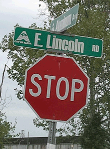
The street signs in the town of Alcoa, Tenn., which I found myself driving through a couple of weeks ago, have this unusual choice of typeface. It looks like Impact, though a bit straighter and narrower than even that impactful typeface. You can see what whoever chose this was thinking: keep it narrow but bold, something that will really stand out when seen from a car driving up to an intersection. The unfortunate part is that it’s too bold; it certainly draws your eye, but that doesn’t make it legible. The excessively fat strokes combined with the compressed shapes, and the very tight spacing and tiny counters, make it turn into a blob of black (or, in this case, white) against the background, so that it’s not in fact easy to read at all.
Oh well. Nice try.