function jdb_page_navigation()
sPageSlug = blog
sPageTitle = easily amused
header:139:aPageArgs:page_title = easily amused
header:140:aPageArgs:section_title =
functions-johndberry:262:aPageArgs:page_title = easily amused
functions-johndberry:298:sPageTitle = easily amused
functions-johndberry:359:sPageTitle = easilyamused

easilyamused |

Archive for 2011

When disaster strikes

Published

As I have followed the news about the earthquake and tsunami disaster in northeastern Japan, naturally my thoughts have turned to the many people we met in both the typographic and science-fiction communities when Eileen and I visited Japan in 2007. Our closest Japanese friends, we found out quickly, were all right, as was everyone in their circle of friends. I certainly hope that all of the wonderful, generous people that I met in the Tokyo Type Directors Club, in the Japan Typography Association, at Idea magazine, and from other parts of the Japanese typographic community are safe and sound; and that all of their families and friends are, as well.

[Photo by Taro Yamamoto, 2007.]

The MyFonts interviews

Published

“In the history of typography,” writes Jan Middendorp in his introduction to Creative Characters: the MyFonts interviews vol. 1, “the 1990s represented a phase of unprecedented democratization of the type design and production process… It seems the 2000s have accomplished a similar step for the user… Today, many managers, secretaries, bloggers or scrapbookers have preferences regarding the fonts they use.”

Creative Characters was launched in 2007 to give a peek behind the creative curtain and introduce “the faces behind the fonts,” the people who design type. The newsletter has been edited by Jan Middendorp, who has conducted interviews with type designers from all across the world of type. Twenty-six of them have been collected between covers in this book.

Middendorp is a good interviewer. He knows his subject, and he asks intelligent questions; he doesn’t ask long, rambling questions to get his own ideas across, but instead looks for for a response from the people he’s there to listen to. The nature of each interview, of course, varies with the interviewee.

Jim Parkinson, the lead-off subject, is self-deprecating in recounting his own notable history as a lettering artist. “Many people who worked for Rolling Stone in the early years still think it was the coolest job they ever had.” And: “Of all the people I have been lucky enough to bump into, Myron [McVay] taught me more about lettering and type design than everyone else put together, save Roger Black. I still do most things the ways Myron taught me.”

That’s not unusual. David Berlow, asked about his influences, says, “I’m still learning a lot from the people I’m supposed to be teaching.” Christian Schwartz, after receiving the Prix Charles Peignot from ATypI: “Although I have some really great collaborators, they’re all far away, so I spend almost all of my time working in my little office at home, by myself, which makes my job seem very anonymous. It’s a real honor to be recognized by my colleagues.”

The range of type designers interviewed here is wide; what they have in common, besides quality, is that they’re all active today, and they all have something to say about their careers and their work. Some dig deep into typographic history for their inspiration; others shun it. Some draw spectacular display faces; some craft meticulous text faces; some do both. The other thing they have in common is that at least some of their fonts are available from MyFonts.com.

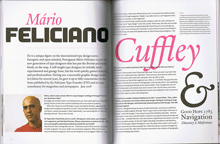
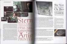
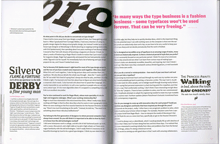
These interviews all appeared first as e-mail newsletters from MyFonts. Like most of us, I receive these delightfully formated e-mails and, more often than not, put them aside in my inbox to read later. I find that it’s easier to read them in this invitingly designed physical book, which has spacious pages, colorful displays, readable text, and a format with flexible covers and loose sewn binding that is light enough to carry around and comfortable to hold in your lap and pore over at leisure. The page design not only shows off each designer’s typefaces, but has varied examples of other graphic designers’ real-world use of the faces – for example, a page of newspaper and magazine designs by Tony Sutton using a range of typefaces from Nick Shinn. Everything about this book is inviting and workable. This is only Volume 1; the series of interviews continues to appear in our e-mail, and I hope the next set will be collected soon in Volume 2.

UW Press celebrated

Published

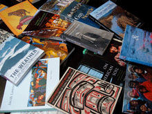
The first Thursday of every month features an “art walk” in downtown Seattle, when galleries throw open their doors and stay open through the evening. On the first Thursday of this month, I dropped by the newly opened storefront space of Marquand Books, on Second Avenue near the Seattle Art Museum, to see an exhibition of notable books from the 90-year history of the University of Washington Press. UW Press has been taking prizes for book design for decades, especially under its long-time art director Audrey Meyer, who retired several years ago. The range of books on display at Marquand reminded me of both the longevity and the quality of UW Press’s publishing program – and of course many of the books themselves were old friends. The way the books were displayed emphasized their covers, but you could pick them up and thumb through them to appreciate the interior design as well. (I looked to see whether the one book I’ve designed for UW Press was included – Answering Chief Seattle by Albert Furtwangler (1997) – but it didn’t make the cut.)

University presses are suffering, like all publishing ventures, from the disastrous economy and the competition of newer publishing technologies, and I’m sure UW Press is no exception. It’s well worth being reminded that a serious and creative approach to publishing, teamed with a sensitivity to book production and design, can produce volumes that we want to keep on our shelves for many years to come.

[Photo: from Marquand Books’ invitation to their “Tribute to University of Washington Press.”]

Jack the printer at 90

Published

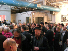
Sunday, December 19, was Jack Stauffacher’s ninetieth birthday, and more than 150 of his friends came to celebrate it at the San Francisco Center for the Book. It was a gathering that illuminated both the breadth of Jack’s knowledge and his influence, through the wide variety of talented, creative people who showed up for the occasion in the midst of a ferociously stormy winter weekend. (“It always rains on my birthday,” Jack told me the day before. “It’s December – what can I expect? The clouds to open, trumpets to sound, and the sun to shine?”)

In talking about Jack, I can’t do better than quote Chuck Byrne, who wrote twelve years ago: “Jack Stauffacher describes himself as a printer. It is a somewhat deceptive term for us today. His use of the term connects him to a five-hundred-year tradition of the entrepreneur-publisher-designer-typographer-printer. Like the best who made up that custom, he possesses a love of type and printing and the ability to convey meaningful words and thought.” (“Jack Stauffacher, Printer,” 1998; cribbed in this case from the AIGA’s webpage from when they awarded Jack the AIGA medal.)

Chuck was one of the organizers of this birthday event, which brought together people from all parts of the Bay Area’s book, printing, arts, and design communities (and a few of us from farther away). It would be impossible to tell you all the people who were there, even if my memory for names hadn’t turned into a sieve. It was certainly a celebration – not just of Jack Stauffacher but of the interlocking creative communities that he has influenced, and continues to influence.

As Andrew Hoyem, of Arion Press, said a couple of days afterward, “I ran into people there that I hadn’t seen in years!”

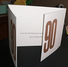
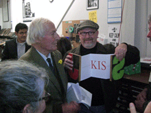
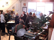
It was a printer’s occasion. In the course of the party, Jack approved the inking on a hand-set letterpress keepsake that he had designed for the occasion, and many people ran off copies. There were a number of other keepsakes distributed, too (I brought one that I had commissioned from Jack leNoir and Maura Shapley at Day Moon Press in Seattle), but the most spectacular was the single big foldout artifact created by Pat Reagh, featuring Jack’s favorite typeface, Kis.

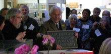
Several of Jack’s friends, and his two daughters, spoke briefly, and Chuck Byrne unveiled the hand-carved alphabet in slate that Chris Stinehour had made for Jack.

When Jack himself took the microphone, he spoke of the ongoing conversation, of how he delights in asking deep questions of everyone he meets, finding out about new things and gaining new understanding. And he urged us to carry this conversation forward – then he put down the mike to let us get on with it.

After all, this was just a birthday party, a punctuation point in a long discourse that’s not done. At 90, Jack may have slowed down a bit – all right, he no longer plays bicycle polo – but he’s still a vigorous voice for excellence, intellectual curiosity, and attention to our cultural history. And he’s intensely interested in what we have to say.

[Photos: (top) keepsake that Day Moon Press created for me for the occasion, designed by Jack leNoir and printed by Maura Shapley; (2nd from top) Jack Stauffacher holding the stone plaque hand-carved by Chris Stinehour; (3rd from top) Jack and Patrick Reagh, holding up Pat’s Kis keepsake; (4th from top) the milling throng; (bottom) milling around a couple of the hand presses at the San Francisco Center for the Book.]

Update: Chuck Byrne has posted three pages of photos taken by him and Dennis Letbetter at the event. For your convenience and amusement – no captions!

Word play

Published

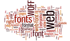
In a completely self-referential bit of digital navel-gazing, I’ve used the little online toy Wordle to generate a “word cloud” from the text of this very page. Wordle takes whatever text you feed it – or the text from a webpage whose URL you give it – and turns it into a visual representation of how frequently the text repeats certain words. The more often the word is used, the larger it appears. Wordle has several controls for changing what the visual representation looks like (color, orientation, language, even whether to exclude or include certain kinds of words), but the end result is generated at random. If you run the same text through again, with the same set of parameters, the sizes of the words will stay the same but the word cloud they form will be different.

As you can imagine, Wordle is a wonderful time-suck. (It’s also hard to type; my fingers keep wanting to type “World” instead.) The word cloud at the left has no significance whatsoever; it just represents what I’ve written in recent blog posts right here (at least, before this post itself is added). But it’s recursive fun.