By all accounts, this year’s ATypI conference was a notable success. People kept coming up to me and telling me how much they were enjoying the event, how impressive the venue was, how well everything was organized, how intelligent the talks were, how much they liked the food. I kept telling them that I couldn’t take any credit for these things, that it was the organizers, both local and from ATypI, who had brought all this together. But it was certainly gratifying to hear.
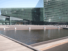
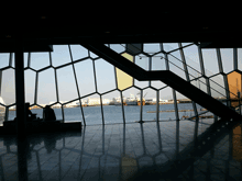
The venue was spectacular: a brand-new building, Harpa, built right on the edge of the waterfront in the harbor of Reykjavík, which houses the national symphony as well as serving as a state-of-the-art conference center. Harpa’s irregular geometry and fishnet-over-glass windows all around highlighted the location and gave us a light, airy interior to inhabit and meet in. Its various meeting spaces were easy to configure for both talks and meals. And when the weather got bad – Sunday saw a good bit of wind and rain – it was satisfying to sit snug in Harpa and gaze out at the wind-whipped harbor.
There were fewer attendees than usual this year (no doubt a reflection of the dismal economy, and of the fact that while Reykjavík is easily accessible from both North America and Europe, it’s not exactly local to anyone but the Icelanders). But those who came were excited and stimulated, and came away talking about ideas.
How often do you have a head of state opening a typography conference? The President of Iceland, H.E. Ólafur Ragnar Grímsson, not only welcomed ATypI to Iceland but gave a twenty-minute talk about the Icelandic language and its typography – an intelligent, eloquent commentary that set a high standard and neatly prefaced our keynote speaker, Gunnlaugur SE Briem. Briem spoke wittily about type, letters, and language. Together, they kicked off the main conference brilliantly.
The theme of the Icelandic letter “eth” (ð, the voiced “th” sound found in English too) led naturally to a rich track of talks on other special characters, and on a wide range of non-Latin writing systems as well. We heard about the typography of Indic, Korean, Arabic, Mongolian, Chinese, and Khmer scripts, not to mention Danish, Irish, German, and Turkish letters within the Latin alphabet. The number of presentations on Indic typography on Sunday was particularly appreciated; and there was talk of making a proposal in a few years for holding an ATypI conference somewhere in India.
The structure this year seemed to work quite well: two preliminary days of workshops and technical and educational items, in two parallel tracks, followed by the official opening on Thursday night and then a single main track of programming on Friday, Saturday, and most of Sunday. This allowed for specialization in the preliminary days, but a common experience during the main conference – and no running around trying to switch from one track to another, or worrying about coordinating the timing between multiple simultaneous talks. Our program structure is partly determined by the venue, but I think we’ll try to repeat this success in the future.
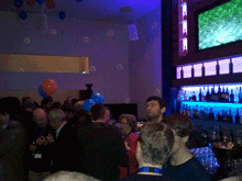
Saturday night we clambered into city buses for a short ride out of town to a penthouse restaurant with wide views in all directions, where the restaurant’s staff were quickly accommodating when they discovered that we had more people for dinner than we had planned. That was followed by a crowded party back in town at the Icelandic Design Centre, and the usual dispersal to the bars of downtown Reykjavík.
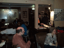
The city is so small that it was easy to keep running into each other; at one point, one of the pleasant local bars was entirely filled with typographers. This also meant that no matter where you were staying, it wasn’t more than a walk away from the conference venue. So not only did Harpa provide excellent spaces for talking and mingling, but the city itself contributed to this lively interpersonal dynamic. Reykjavík is a very cozy capital.
For a flavor of the event, check out write-ups by Roger Black on his blog (“We are all one culture, here on Œŧħ. We’ve just taken different glyphs”) and by Dan Reynolds on ilovetypography (“Font editors & a book steal the show”), and scan the photos from various attendees on Flickr. (I’d be happy to hear of other reports that I’ve missed.) And take a look at the impressionistic, kaleidoscopic videos put together by a group of young Icelandic filmmakers who were roaming the conference, cameras in hand.
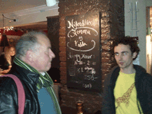
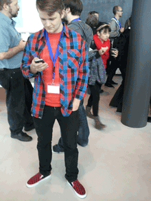
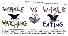
[Photos, top to bottom: the exterior of Harpa, with pool in front; the interior of Harpa, looking out; the bar before Saturday’s gala dinner; Thomas Phinney and Dawn Shaikh, at the pub; Mark Barratt and Dave Crossland, suitably out of focus, at another pub; Nick Sherman’s sartorial splendor (what, no hoodie?); and one of the images from the Typographer’s Guide to Iceland.]

