It was impossible resist: when I got the package from House Industries with the catalog for their new Photo-Lettering collection, I had to use my old Photo-Lettering, Inc. letter-opener to slit the envelope. It seemed the right thing to do.
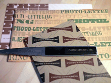
The catalog showcases lots and lots of newly digitized Photo-Lettering fonts from the heyday of over-the-top advertising typography in New York. Like all of House Industries’ productions, it’s a keepsake in itself. The cover stock for the catalog was milled exclusively for House by the only other business that could match their flair and sensibility, French Paper.
Most of the lettering styles sold by Photo-Lettering, then and now, are playful and exuberant; they were headline styles, sold to type shops that would price headlines for their clients by the letter or the word. Today you can buy headlines the same way, but in digital form, from photolettering.com.
The letter-opener? It was on my desk when I started at ITC as editor of U&lc, just down the block from where Photo-Lettering’s shop used to be; and it’s on my desk today.