I spent last Friday at the School for Visual Concepts, where a full day of talks about American type design was part of the two-day Type Americana conference. (The second day was hands-on workshops; they filled up and even had overflow sessions, but I didn’t participate in that aspect of the event.) We were shoehorned into a small, cozy space, the SVC gallery, but that made it easy to see and hear.
The individual talks all seemed to be carrying on a conversation with each other, as topics and historical people overlapped and interacted. Patricia Cost’s talk about Linn Boyd Benton fit naturally with Juliet Shen’s talk about his son Morris Fuller Benton; both of them shared references and contexts with Thomas Phinney’s talk about the American Type Founders (ATF), where both Bentons had worked. Steve Matteson’s talk about Frederic and Bertha Goudy intersected with Paul Shaw’s on W.A. Dwiggins, since Goudy and Dwiggins shared a home and a studio for two years in Massachusetts. Shelley Gruendler, talking about Beatrice Warde, said she had learned a fact she’d never known about Beatrice during Paul’s lecture. Jim & Bill Moran’s talk on the Hamilton Wood Type Museum didn’t directly impinge on the earlier designers, but it was part of the same hundred-year history. All in all, this was a remarkably concentrated dose of information and anecdote about the history of American type designers.
The final talk didn’t intersect quite so intimately with the others, but that’s because it was about a more recent period: Sumner Stone’s days as the first typographic director of Adobe, and the creation of Adobe’s program of original typefaces. Sumner said this was the first time he had spoken about that period publicly; it had been too close before. He not only told us tales of how Adobe hired him and how he developed the type program, but he set the stage by explaining the state of the type business and technology at the time Adobe started up. Most of it wasn’t new to me, apart from some of the anecdotes, but it was fascinating to hear Sumner put it all together. I hope he writes it up, or otherwise records it for posterity.
That could be said of all the talks: they all cried out to be expanded and recorded in more permanent form. The information communicated in that room last Friday could not be found anywhere else, at least not all together; it was the fruit of several people’s dedicated research, and much of it doesn’t exist anywhere online. (At least not yet.) Everyone spoke well, and the audience was rapt. Juliet Shen, who spearheaded the effort, and the supporting staff at SVC, put on a fine event.
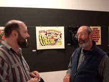
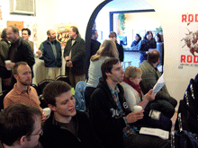
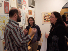
[Photos: (top) Thomas Phinney & Sumner Stone; (middle) audience during a break; (bottom) Thomas Phinney, Michelle Perham, Kristine Johnson.]


