As part of my ongoing collection of faded, broken, and disinherited lettering, I snapped this sign outside one of the Microsoft buildings that once belonged to a different company; you can see the faint spoor of an older building name in the holes below the current sign. Typographic entropy always interests me.
![]()
easilyamused |
Archive for May, 2010

Palimpsest
Published
Don’t wrap it, I’ll read it here
Published
The demo of a new online interface for Sports Illustrated, based on HTML5, does a good job of showing off fancy magazine layout in a screen-friendly format. But it falls down when you look closely – when you tear your eyes away from the action photos and try to read the text.
Like all those current e-books, this e-magazine falls down in simple text typography. The text of the articles is justified, yet there’s no hyphenation. When your text composition engine doesn’t even hyphenate the word “grandmother” at the end of a loose line, it’s just not doing its job.
The page designers at Sports Illustrated make it even harder by shoving intrusive pull-quotes into the main text block and wrapping the text around them. This is a bad enough at any time (it says, in effect, “we don’t care about the words, just the shape”), but it’s inexcusable when you can’t even hyphenate those extra-short lines next to the pull-quotes. Text wrap and justification rarely work together. (Anybody heard of a multi-column grid?)
Oh yes, and the pull-quotes use straight apostrophes. With a non-typewriter typeface.
In a tweet today, after seeing the demo, Roger Black called it “The best digital magazine . . . yet!” Which may be true – but if so, there’s still a long way to go.
[Images at left from the YouTube video about the HTML5 new prototype.]
With a little text
Published
Cory Doctorow was in town Friday, as part of his whirlwind tour for his new book For the Win, and Linda Stone hosted a small late-afternoon gathering for him on her back deck. (Linda’s house has a glorious view of Lake Washington, and Friday turned out to be a warm, sunny day. We even spotted a bald eagle cruising overhead. “The emperor will die,” muttered Matt Ruff, gnomically.)
Cory had with him four printed copies of his next new book, the quixotic project With a Little Help, each with a different cover. This is a collection of short stories, which Cory is publishing himself in a variety of formats, some of them given away – largely to find out what happens when you do this without a regular publisher. I had designed and typeset the interior of the book, creating pages that I hoped would work both printed and bound as a perfect-bound paperback by Lulu and read as a PDF onscreen, but until Friday I hadn’t seen it printed out, except as drafts from my laser printer. Now I have an advance copy, with a cover by Frank Wu, and I’m pretty pleased with the way it all came out. The binding is flexible, and the paper is an off-white with no glare. (Cory was going to get some galleys printed at a quick-print shop in London, but found that it was cheaper just to order copies for himself from Lulu and have them delivered to him en route. A truly dispersed publishing method!) The pages seem readable, which is the whole point.
I’m not sure when the official launch is, but no doubt it’ll be soon. Meanwhile, if you’re in San Francisco this Wednesday, Cory will be doing a benefit reading at the 111 Minna Gallery, as a fundraiser for EFF (Electronic Frontier Foundation).
The typography of e-books
Published
It’s gratifying to see, at last, some attention given to the shortcomings of the various e-readers. It took the hoopla around the introduction of the iPad to get us to this critical state. Perhaps the most telling thing about the iPad as a reading device is where it doesn’t improve on its predecessors.
None of the existing e-reading devices – or at least none that I’ve seen – have good book typography. They look superficially impressive – “a decent simulacrum of printed pages,” as Ken Auletta said of the Kindle in his recent New Yorker article – but when you look closely at the actual words on the page, you find that they’re rather crudely typeset. I’m not talking about the fonts or how they’re rendered onscreen; I’m talking about spacing, which is what typography is all about. Most notably, none of the most popular e-readers employ any kind of decent hyphenation-and-justification system (H&J, in digital typesetting terms). And yet all of them default to fully justified text.
As anyone who has done production typesetting or has designed a book meant for reading knows well, the factors that make a block of text easy or hard to read all occur at a scale smaller than the page. The most obvious is the length of the line, but line length is engaged in a complicated dance with the space between lines, the space between words, and the spaces between letters. The choice of typeface is almost irrelevant; any legible typeface can be made readable with enough care given to the spacing. (Well, almost any legible typeface.) Finding the right combination of all these factors for a particular typeface, and for a particular author’s words, is what text typography is all about.
All of these space relationships will be thrown to the winds if you typeset a page with justified text but no hyphenation. There’s a reason why the words “hyphenation” and “justification” are used together.
In producing a printed book, you can massage all these variables until you get pages that look consistent and that are effortlessly readable. You can do the same for a book that’s going to be read on a screen, but only if the end result is in a static format, such as a PDF document – essentially, a printed page by other means.
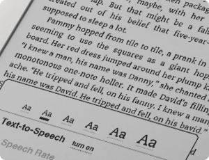
But one of the great advantages of e-readers is that you can change the type size at will. (In some, you can also change the typeface, within a narrowly circumscribed range of choices.) Lovely! But then what happens to all those careful choices about line length and word spaces and so on? They have to be made again, on the fly, automatically, by the software. And if the software isn’t smart enough to know how and when to divide words, then the spacing is going to look like hell.
Which is pretty much the way it does look, except when we get lucky, on all of the popular e-reading platforms. Great big holes appear in some lines, or a cascade of holes opens up on adjacent lines, which typographers call a “river.” It’s not just ugly; it slows down reading.
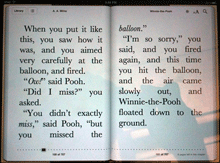
This is bad enough on a normal rectangular page, but it gets even worse when some visual element – an illustration, for instance – intrudes into the text block and the text has to wrap around it. Bad examples abound.
Some people like justified pages on an e-book page because they’re used to it in printed books. Fine. But they’re also used to better typesetting in printed books (even sloppily done ones) than we’re getting so far in e-books. The simplest solution is to give the reader a choice: justified or unjustified. And make the default unjustified. A ragged right-hand edge is easier to read than a ragged middle that’s full of holes.
The ideal solution, of course, is to have a good H&J system built into the e-book reader. But creating a really good hyphenation and justification program isn’t a trivial undertaking. Not only does the software have to know where it can break a word, and have some parameters for knowing when to break it, but the program should also modify these choices depending on the lines above and below the current line. This is what Adobe InDesign’s “multi-line composer” does. No automated system is perfect, but InDesign’s default text composition is pretty good. Certainly something like that would be a vast step upwards from what we see in e-books today.
Since we’ll all be stuck reading digital books at least some of the time, I’d like to see the standards of book composition improve, and improve fast. It might start with reviewers not blithely passing over the poor typesetting and getting wowed by the hardware or the pretty pictures. There has to be a demand for good composition in e-books. Attention to quality on that level doesn’t often get rave reviews; most people never consciously notice it. But they definitely notice it on an unconscious level, and it affects their willingness to read a book or abandon it. This is true in printed books; it’s just as true in e-books.
Who will bring out the first really good e-book reader?
[Photos: iBooks page spreads from iPad in landscape mode (left); animated GIF of Kindle page as the font size changes (above).