function jdb_page_navigation()
sPageSlug = blog
sPageTitle = easily amused
header:139:aPageArgs:page_title = easily amused
header:140:aPageArgs:section_title =
functions-johndberry:262:aPageArgs:page_title = easily amused
functions-johndberry:298:sPageTitle = easily amused
functions-johndberry:359:sPageTitle = easilyamused

easilyamused |

Archive for 2010

When s changed

Published

The best use I’ve seen yet of Google Labs’ nifty new Books Ngram viewer is from Frank Chimero: “Rest in peace, medial s.” By doing a little intelligent searching on several words that would have used the long-s in earlier books but had lost that form in more recent times, he pinpointed when it changed: right around the year 1800.

Which is just about what I would have guessed, based on a thoroughly unscientific analysis of what I recall from books and publications I’ve seen from various periods. It also corresponds reasonably closely to the much more detailed summary given by James Mosley in his article “Long s,” which records not only changes in usage around the turn of the 19th century but also changes in the availability of the long-s in new type fonts.

[Image: long & short italic s, and a long-s/t ligature, from Adobe Jenson Light]

Font science

Published

The Large Hadron Font Collider could soon begin a search for new sub-pixel positions, a leading typographer says.

If commissioning work goes well, the LHFC could become sensitive enough to probe a hitherto unexplored domain in typography by the end of the year.

Among the first candidates for discovery are two discretionary ligatures that have been predicted to exist. The £6bn ($10bn) collider is being used to smash together kerning pairs to shed light on the nature of the Universe.

With a little help from his friends

Published

Cory Doctorow’s self-published book With a Little Help has just been released. It seems a little redundant to announce something done by Cory, who has one of the most ubiquitous and entertaining public personas on the web, but I had a hand in this particular project. As I wrote last May, I designed the interior of the book and did the typographic production for the printed version, although the covers are entirely out of my hands. (There are several versions of the covers.) He’s been writing about the project for Publishers Weekly, so it’s not exactly a low-profile endeavor. Nonetheless, it’s an experiment – to see how a book published entirely outside the normal publishing channels compares in sales and success to one done the normal way. Let’s see how it does.

Oh, by the way, Cory writes good stories.

[Image: one of the four alternate covers to the paperback edition, this one by Frank Wu.]

Web type at last!

Published

This has turned out to be the year of web fonts. I don’t just mean typefaces designed for use on the web; that’s been going on for at least a decade and a half, most notably with the spread of Verdana and Georgia throughout the online world. I mean that at last we’re getting a workable system for using a variety of typefaces on web pages – and being reasonably certain that everyone viewing those pages will see the same typefaces, not some substitute based on what happens to be available on their computer.

A year ago, this seemed impossible. There was a whole track of programming at the ATypI conference in Mexico City about web fonts, and lots of interest in the topic, but there seemed to be no common ground for agreement about the right way to move forward.

WOFF

In the past year, however, the key players came together to form a Web Fonts Working Group under the auspices of the W3C (World Wide Web Consortium), and after months of hard work and persuasion, they agreed on a new format for web fonts. It’s called WOFF (Web Open Font Format), and it’s well on its way to becoming a generally accepted standard. According to Erik van Blokland, one of the creators of the format, WOFF will be “the only (!) specification that W3C will recommend for use on the web.”

All of the newest versions of major browsers, either out now or out soon, support WOFF, including the recently-released beta version of Internet Explorer 9. (Mozilla Firefox was the first to implement WOFF support; Mozilla was one of the developers of the format.) Browsers may implement other formats as well, but WOFF is likely to be the only format that’s guaranteed to work across all “modern” browsers.

Properly speaking, WOFF isn’t a new font format; it’s a software wrapper around an existing TrueType or OpenType font. The WOFF wrapper includes “metadata” – information about the font – that font vendors can use to tell you who designed the typeface, who licensed it to you, and what the terms are for that license. This is just information; there’s no enforcement involved, no DRM, nothing to prevent someone who’s willing to go to a little trouble from unpacking the font inside the wrapper. The purpose of the metadata is to make it obvious to anyone who downloads the font that it’s a web font, intended for use while viewing a web page, not a “desktop” font that you can use in any file or application you want. This whole approach is promulgated on the assumption that most people, if it’s clear and easy for them to do the right thing, will, in fact…do the right thing.

Web-font services

The newest versions of all the major web browsers support WOFF, which makes it a universal format going forward. Looking backward, of course, is another story. What about older browsers that don’t have WOFF support built in? Lots of websites will be viewed in older versions of all of the major browsers. That’s where web-font services come in.

At the same time that vendors and manufacturers are coming out with sets of fonts intended for the web, an increasing number of web-font services have sprung up, each offering its own system for supplying those web fonts to designers and end users.

There are two parts to a web-font service: 1) making the fonts available to web designers so they can specify them in the designs of their web pages; and 2) enabling those fonts to be downloaded to users’ systems when they view those web pages.

The web-font service takes care of delivering the right fonts in the right formats to each version of each browser; the website host or designer makes an arrangement with the service, usually for a fairly nominal fee, and then uses the fonts available for that service in designing their web pages.

The list of web-font services is growing almost daily; so is the list of font foundries who are offering their fonts in web versions. There are many different ideas about the best way to do this, both technically and from a business standpoint. A web designer just has to pick one and give it a try. They’re all available right now.

There is variation in quality, of course. Typekit, for instance, which is perhaps the best known, offers fonts from a lot of different foundries; some of them are better engineered for onscreen use than others. Webtype.com, launched by Font Bureau, offers not only a web-font service but several families of carefully designed new fonts, with their roots in metal but their forms dictated by what works onscreen. Adobe recently launched their web-font library, a wide selection of font families from their larger font library, and already Adobe has upgraded and improved the rendering of some of those fonts. On the web, it’s very easy to update things, to iterate; there’s no final form. Now that the floodgates have opened, you can expect things to keep changing fast, and the quality to keep getting better at a rapid rate.

For users, the WOFF revolution is a very good argument for upgrading your browser, since only the newer versions of each browser will support this format. (You may get good results from some of the backward-compatible formats offered by some web-font services, but you will get better results – the type will be more readable – with an up-to-date browser.) If you’re a web designer, it’s time to start looking into WOFF.

[Image: an apt slogan taken from the homepage of webtype.com]

American type design revealed

Published

I spent last Friday at the School for Visual Concepts, where a full day of talks about American type design was part of the two-day Type Americana conference. (The second day was hands-on workshops; they filled up and even had overflow sessions, but I didn’t participate in that aspect of the event.) We were shoehorned into a small, cozy space, the SVC gallery, but that made it easy to see and hear.

The individual talks all seemed to be carrying on a conversation with each other, as topics and historical people overlapped and interacted. Patricia Cost’s talk about Linn Boyd Benton fit naturally with Juliet Shen’s talk about his son Morris Fuller Benton; both of them shared references and contexts with Thomas Phinney’s talk about the American Type Founders (ATF), where both Bentons had worked. Steve Matteson’s talk about Frederic and Bertha Goudy intersected with Paul Shaw’s on W.A. Dwiggins, since Goudy and Dwiggins shared a home and a studio for two years in Massachusetts. Shelley Gruendler, talking about Beatrice Warde, said she had learned a fact she’d never known about Beatrice during Paul’s lecture. Jim & Bill Moran’s talk on the Hamilton Wood Type Museum didn’t directly impinge on the earlier designers, but it was part of the same hundred-year history. All in all, this was a remarkably concentrated dose of information and anecdote about the history of American type designers.

The final talk didn’t intersect quite so intimately with the others, but that’s because it was about a more recent period: Sumner Stone’s days as the first typographic director of Adobe, and the creation of Adobe’s program of original typefaces. Sumner said this was the first time he had spoken about that period publicly; it had been too close before. He not only told us tales of how Adobe hired him and how he developed the type program, but he set the stage by explaining the state of the type business and technology at the time Adobe started up. Most of it wasn’t new to me, apart from some of the anecdotes, but it was fascinating to hear Sumner put it all together. I hope he writes it up, or otherwise records it for posterity.

That could be said of all the talks: they all cried out to be expanded and recorded in more permanent form. The information communicated in that room last Friday could not be found anywhere else, at least not all together; it was the fruit of several people’s dedicated research, and much of it doesn’t exist anywhere online. (At least not yet.) Everyone spoke well, and the audience was rapt. Juliet Shen, who spearheaded the effort, and the supporting staff at SVC, put on a fine event.

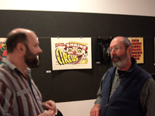
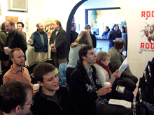
[Photos: (top) Thomas Phinney & Sumner Stone; (middle) audience during a break; (bottom) Thomas Phinney, Michelle Perham, Kristine Johnson.]

Re-fi type hell

Published

Sometimes you just have to show a really bad example. The one you see on the left is an online ad that appeared recently on a popular web page. It’s not high-end advertising design. The open-book metaphor seems to fight with the interactive drop-down lists, and in a misguided attempt to suggest the printed page, the designer has let the program freely alter the spaces within words and lines, without the aid of anything so mundane as a hyphen. The result is magnificently bad.

In those 19 lines of text, there are almost none that are typeset competently. Words are squashed together, other words are stretched out, all with no apparent logic except to force them into those terribly narrow justified columns. It’s hard to imagine this ad enticing anyone to read the text, even if they were hooked by the promise of the headline. What an open book has to do with refinancing a mortgage is anyone’s guess, but this miniature version is about as far from the even texture of a well-typeset page as you can possibly get.

Pontificating

Published

I was interviewed last week, along with Simon Daniels, by “unsolicited pundit” Glenn Fleishman, who writes regularly for the “Babbage” blog on The Economist‘s website. The subject was type on the web – a huge subject that I’ve been trying to write my own blog post about without success. I guess it’s easier to have someone else asking the questions (and writing up the answers) than to put it all together yourself. I think Glenn plans to write more about the subject; this one article doesn’t come close to exhausting it, but it’s a good start.

Type Americana

Published

On November 12 & 13, the School of Visual Concepts in Seattle is hosting a two-day event on the history of American type design, called Type Americana. The first day features eight talks; the second day is workshops, one by Sumner Stone and one on wood type. You can attend just the day of lectures, or both days (spaces in the workshops are limited).

The talks: Thomas Phinney on American Type Founders, Paul Shaw on D.A. Dwiggins, Jim & Bill Moran on Hamilton Wood Type, Patricia Cost on Linn Boyd Benton, Sumner Stone on the early days of Adobe Type (Sumner was Adobe’s first Type Director), Shelley Gruendler on Beatrice Warde, Juliet Shen on Morris Fuller Benton, and Steve Matteson on Fred & Bertha Goudy.

The workshops: “Vintage Letterpress with Hamilton Wood Type,” taught by Jim Moran and Bill Moran; and “ThinkWrite,” taught by Sumner Stone.

In addition, Friday night will be the Northwest premiere of Richard Kegler’s film Making Faces: Metal Type in the 21st Century, about the work process (and the personality) of the late Jim Rimmer, working and talking at his home-based type foundry outside Vancouver. I’ve seen an unfinished version of this film, and it’s amazing.

Matthew Carter: MacArthur Fellow

Published

Matthew Carter has been named one of the 2010 MacArthur Fellows – a justly deserved honor with a very handy monetary package attached. It’s usually nicknamed the “genius grant,” and Matthew has lots of excellent company both this year and throughout the history of the fellowships.

This news follows hot on the heels of his being given the AIGA Boston Fellow Award just last Friday, at a sold-out event at the Cambridge Public Library. There must be a lot of feelings of good fellowship swirling around Cambridge this week.

Congratulations, Matthew!

Huronia

Published

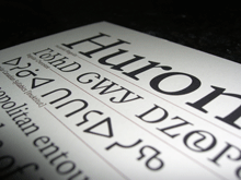
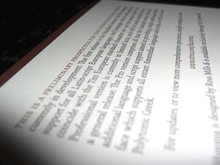
At TypeCon in Los Angeles, Ross Mills is handing out nicely printed type specimens of his newly released typeface Huronia. It’s a sturdy, compact serif design that looks as though it will be immediately useful as a book typeface. Andrew Steeves of Gaspereau Press describes Huronia’s “tensile strength and character,” which seems a good way of expressing the nature of this text type.

The current release is the standard character/glyph complement, which contains an extended Latin character set – that is, the letters that we use in English and most other European languages. A later release will include full support for “all American languages,” including the writing systems used for Cherokee, Cree, and Inuktitut. Those beautifully designed glyphs are shown on the type specimen alongside the English text.