function jdb_page_navigation()
sPageSlug = blog
sPageTitle = easily amused
header:139:aPageArgs:page_title = easily amused
header:140:aPageArgs:section_title =
functions-johndberry:262:aPageArgs:page_title = easily amused
functions-johndberry:298:sPageTitle = easily amused
functions-johndberry:359:sPageTitle = easilyamused

easilyamused |

Archive for 2009

Swiss-style Latin in Montreal

Published

When I was in the Mile End neighborhood of Montreal a couple of weeks ago, I happened to spot this idiosyncratic logo on a local shop. First I noticed the van, pulling into a parking space outside the shop; then I realized that the shop itself was the business with the logo.

The letters are clearly a heavy, wide variation of Helvetica (or something modeled on it very closely), but someone has given these precise Swiss letters little tails, joining them up into a connected script. Nobody re-drew the letters; that’s obvious from the mismatch between the curl of the “t” and the much narrower joining stroke. (My guess is that the capital-L is really a cap-I with the joining stroke added.) It’s clever, even it’s mechanically rendered. And it’s certainly a strange juxtaposition of cultural tropes, all in a few letters on a shop awning and a delivery truck.

Logo on shop awning

Type designs from Mexico

Published

As called out recently on FontFeed, Mexican designer Isaías Loaiza Ramírez has posted on Flickr a bunch of images of Mexican typefaces in action, from the presentation first shown at TypeCon 2007 in Seattle. These images serve as an excellent fore-taste of the typographic exuberance that will be on display in Mexico City at the 2009 ATypI conference, Typ09.

Mexico! the heart of the letter, animated

Published

Last year, Gabriel Martínez Meave and his colleagues Isaías Loaiza Ramírez and Alfredo Lezama Osorio created a dramatic short video about Mexico and typography, which was first seen at ATypI 2008 in St. Petersburg when Roger Black and Ricardo Salas presented the 2009 ATypI conference, Typ09, for Mexico City. This animated video is now up on YouTube, where you can see it for yourself. (Warning: contains music.)

Typ09, the 2009 ATypI conference | Mexico City | October 26–30, 2009

Mexico Typ09 video

Mexico Typ09 video

Mexico Typ09 video

TypeCon2009

Published

Since Thursday, I’ve been at TypeCon Rhythm in Atlanta. It’s a far cry from that first TypeCon, in a motel near an office park in Westborough, Massachusetts. Although this year’s TypeCon is noticeably smaller than in recent years (everyone’s feeling the economic pinch), it’s been lively. And the weather hasn’t been as brutal as you might expect in Georgia in July.

The program has been varied and mostly engaging. Gerard Unger was here to receive the 2009 SOTA Typography Award – richly deserved, and greeted with a standing ovation. As always, he has been friendly and approachable. I missed the Type Crit, when he, Matthew Carter, Akira Kobayashi, and John Downer offered their critiques and commentary on typeface designs that were submitted to them, but it’s always a high point, even for those who aren’t type designers. Bruno Maag did a heartfelt rant on the importance of non-Latin type design (and the wide-open markets for new non-Latin typefaces). Shelley Gruendler told the story of Type Camp, the hands-on learning experience that she started in frustration at the teaching of type in Vancouver and that she is now taking around the world. Rick Anwyl gave a somewhat scattershot but moving account of the origins and the saving of the CBS typographic wall, the “gastrotypographicalassemblage” created by Lou Dorfsman and Herb Lubalin, which once graced the wall of the employee cafeteria at CBS headquarters in New York and is now being slowly restored at Atlanta’s Center for Design Study. Zeena Feldman spoke provocatively about the idea of how visual design contributes to the sense of a globalized “non-place” wherever you go. Heather Shaw gave an intriguing account of how she had taught web typography by having students figure out how to reproduce classic layouts of the New Typography using HTML and CSS, thus connecting contemporary technology with the revolutionary typography of eighty years ago.

It goes on tomorrow, kicking off with a two-hour panel on the hot topic of web fonts – how you can give web designers a way to use real typefaces without either turning them into graphic images or giving away digital fonts to everyone who views a web page.

TypeCon is one of the two major typographic events of the year (the other being ATypI). Both of them share at least one characteristic: no matter how stimulating the program may be, the heart of it all is the social and personal interactions, among old friends, current colleagues, and new acquaintances – who may in turn become old friends in future years. And sometimes you go off on a tangent: on Friday night, I ended up accompanying Paul Shaw and Frank Wildenberg to an Atlanta Braves baseball game (my first live baseball game in thirty years). It was a way to get a little sense of Atlanta beyond the vicinity of the conference hotel. (And, as it turned out, to see some fireworks.)

Next year’s TypeCon will be in Los Angeles. It’ll be worth being there.

[Photos: Hatch Show Print posters after Jim Sherradan’s keynote talk; opening slide at the presentation of the SOTA Typography Award to Gerard Unger; and two sculptures by June Corley made out of physical letters, from a gallery exhibit at the Grand Hyatt. More photographs here.]

Angles of acuteness

Published

This outdoor telephone box sits next to the entrance to one of the far-flung buildings on the Microsoft corporate campus. It’s a remarkable example of someone thinking about what angle you might be looking at a sign from. Viewed straight on, the lettering looks curiously wide and squat; it takes you a minute to figure out what it says, though it’s ultimately recognizable. The lettering style really comes into its own, however, when viewed from an acute angle – as might be the case if you were approaching the door from the side. The word is most readable when it’s seen from the most extreme angle.

I suppose they could have simply put the word ‘TELEPHONE” on the side of the box, too, and solved the problem that way. But this is an ingenious bit of sideways thinking.

Drive-by typography

Published

Last week we were in Madison and other bits of Wisconsin, and on the way home I noticed this bit of inadequate signage at the Dane County Airport in Madison. (This is, I should note, generally a very well designed small city airport.) We were flying on Northwest, but the signage problem would be the same for any airline. It’s all about, as I keep saying, space.

When you’re driving up to the Departures gates at an airport, what is the primary thing you’re looking for? The name of the airline. In an airport the size of Madison’s, there’s no question of multiple terminals; it’s just a matter of deciding where to pull up at the sidewalk and let your passengers off. The one and only thing that the signage needs to do at that point is identify each airline, distinguishing it clearly from all the others.

This sign for Northwest Airlines fails at its task. (The signs for the other airlines fared similarly poorly; this just happened to be the airline we were flying on.) The light, thin letters are squashed together so tightly that you cannot distinguish one from the next at any distance – and distance is exactly what counts in signage like this. The tight spacing might be readable if you were looking at this on a printed page held in your hands; at a distance of thirty or forty yards, as you drive up to the terminal looking for the right airline, it just merges into a single barely intelligible shape. (I almost wrote “unintelligible,” but since the name is set in caps and lowercase, rather than all in caps, at least it does have an irregular shape that you might potentially recognize.)

The two photos at the left are close-ups, one closer than the other; the one below is a more realistic example of what you might see as you arrive at Departures. (Except that I’ve sharpened the photographs in Photoshop, so they might be a little easier to make out.)

Sure, other airlines have longer names, which would fill up more of the area of the sign. But that’s not the point. The spacing is much too tight for a functional sign. The curbside signage at the Dane County Airport may look elegant, but it doesn’t do its job.

I only wish it were alone in this failure. Unfortunately, it has lots of company.

Distant shot of airline signage at Madison airport

Not-so-fine print

Published

Today’s New York Times has an article about the new credit-card legislation that just passed the U.S. Senate (and, later in the day, the House), which would limit the exorbitant interest rates and extra fees and sudden changes of terms that have become standard practice among credit-card companies in recent years. One of the details that I noticed deep in the article has typographic relevance:

“The bill also bans expiration dates on gift cards and certificates any sooner than five years after the card’s original issue date. And the retailer or card issuer will have to print the terms of any expiration date in capital letters in at least 10-point type. Call it the fine print rule.”

Capital letters? I can see the intended effect, but the real effect will be to make the important text less readable than it would otherwise be. ALL-CAPS are inherently less readable and less inviting than upper- & lowercase – especially if they haven’t been tracked looser than normal, to give a little extra space between letters.

Legal contracts such as “Terms of Use” agreements often use all-caps to emphasize the most important parts. But if there’s a long passage in caps, it’s even more likely to be skipped by anyone reading it than the regular text might be. (Perhaps this is the point, in some legal agreements.) Far better would be to set the important bits in normal case but make it bold for emphasis. (Maybe not in Times New Roman, whose bold is really a headline typeface rather than a bolder version of the text face.)

Requiring “capital letters in at least 10-point type” does have one advantage: it’s easy to define. Although typefaces vary wildly in their apparent size, it’s usually the lowercase x-height that varies the most (compare Times and Helvetica at the same point size); the capital letters are likely to be of similar height even when the design is different. But this just highlights the folly of trying to define legible type simply by its point size.

Incriminating evidence: Type90

Published

The first type conference I ever attended was Type90, the 1990 ATypI conference in Oxford, England. It was also the first ATypI event that was truly a conference, widely publicized, rather than a “congress” of insiders. Type90 was the brainchild of Roger Black, who even then was a well-known editorial designer and had just co-founded the Font Bureau. This year’s ATypI conference, the first one in Mexico City, is also Roger’s brainchild, which is one of the reason’s he pushed to have it called “Typ09,” as a sort of allusion to or inversion of Type90.

At Type90, I was a newcomer; I knew only a couple of people there, though I knew a few others by reputation. Several of us relative newcomers ended up hanging out together during the weekend; a number of friendships began there.

Not too long ago Thom Feild unearthed a photo from Type90, showing a bunch of us in a pub on the final day of the conference. Recognize anyone?

[Photo (counterclockwise from lower left): Phil Baines (London), Tom Bee (Edinburgh), Susan Skarsgard (Ann Arbor), me (Seattle), Iskra Johnson (Seattle), Thom Feild (Seattle), random local at the table behind us (Oxford, presumably), and April from Apple (Cupertino; sorry, neither Thom nor I can remember her last name). Photo copyright by Thom Feild. Slightly larger version here.]

Alphabets in motion

Published

Last week I stopped by the opening of an exhibit at Seattle Central Community College, showcasing the work of students from SCCC’s graphic-design course taught by Jennifer Kennard, “X Type: Experimental Typography.” There was some noteworthy work, and I suggested to Jennifer that there ought to be a website showing it. One of the more unusual works was a video by Sean Fischer, featuring dancers enacting, horizontally against a white-sheeted background, the letters of the alphabet. To see the video, check out this link, then scroll down until you find “Dancers Expirimental Type” (yes, with that spelling). It’s refreshing, amusing, and the dancers were obviously having a lot of fun. (Note: there’s music with the video.)

If you’re in Seattle, it’s worth visiting the atrium gallery at SCCC and checking out the show.

[At left: the letter C.]

Detail in typography

Published

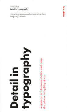
When I read through the new edition of Jost Hochuli’s Detail in typography, I found myself wondering, “Have I really learned anything about type in the last twenty years?” Most of the points I find myself making to people over and over again can be found in these pages, organized and explained more clearly than by any other writer I know. A large part of what Hochuli says can be summed up (inadequately) in the aphorism I keep repeating: typography is all about space.

Detail in typography was originally published in 1987 by Compugraphic, as one of a triad of little booklets by Jost Hochuli; the other two were the complementary volume The design of books and a jeu d’esprit called Jost Hochuli’s Alphabugs, in which the author/designer played with expressive display typography and the meaning of words. The books were (all three of them, I think) published in several languages; the English-language edition was translated by Ruari McLean. (One of my two copies of Detail in typography is inscribed to me by Ruari McLean, dated February 1989. I never met McLean, unfortunately, though we were in contact about his then-unpublished translation of Jan Tschichold’s Neue Typographie.)

The book was revised and updated in German in 2005, and this new English edition, published by Hyphen Press in London, is expanded and newly translated by Charles Whitehouse. Although the book is slightly longer than its first edition (64 pages instead of 48), its format is even smaller: 125 x 210 mm, to match the Hyphen Press format for small books. It fits handily in most pockets. Like its original edition, this one is two-color, paperbound with full-width flaps, on uncoated off-white paper stock, and it opens easily in the hand. Jost Hochuli is a master of book design, and Robin Kinross, proprietor of Hyphen Press, is a stickler for production quality.

Hochuli’s focus in this little book is the details of text typography, or “microtypography.” (The design of pages and whole publications is the realm of “macrotypography”; he has expanded on that subject in Designing books: practice and theory.) The fundamental elements that he writes about are the letter, the word, the line, linespacing, and the column, with a bit at the end that he calls “the qualities of type.” He leads off with a short discussion of the process of reading; this was where I first encountered the word saccade, a technical term for rapid eye movement, specifically the way our eyes move as we read a line of text. (They don’t move smoothly along the line, but jump from clump to clump of letters – not necessarily by word, but by visual cluster. They jump backwards, too, quite frequently; just how frequently is one of those things we quantify while trying to come up with a scientific measurement of readability.)

I won’t make Hochuli’s points for him here, nor will I expropriate them as my own. (I quote them often enough.) I’ll just repeat one paragraph from his introduction, because he clearly lays out the scope of what he’s writing about:

While macrotypography – the typographic layout – is concerned with the format of the printed matter, with the size and position of the columns of type and the illustrations, with the organization of the hierarchy of headings, subheadings and captions, detail typography is concerned with the individual components – letters, letterspacing, words, wordspacing, lines and linespacing, columns of text. These are the components that graphic or typographic designers like to neglect, as they fall outside the area that is normally regarded as ‘creative’.

This is one of those books that belongs on everyone’s bookshelf – everyone who deals in any way with turning text into readable pages, whether the words are their own or someone else’s.