function jdb_page_navigation()
sPageSlug = blog
sPageTitle = easily amused
header:139:aPageArgs:page_title = easily amused
header:140:aPageArgs:section_title =
functions-johndberry:262:aPageArgs:page_title = easily amused
functions-johndberry:298:sPageTitle = easily amused
functions-johndberry:359:sPageTitle = easilyamused

easilyamused |

Archive for August, 2009

Typ09: very early registration

Published

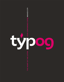
Registration is now open for Typ09, the 2009 ATypI conference in Mexico City (26–30 October 2009). To register, go to the ATypI Store. The sooner you do this, the cheaper it will be: there’s a very early rate, an early rate, and a regular rate, depending on how close to the conference dates you register. The very early rate is good until Sept. 11.

The conference takes place during the last week of October, which is after the end of the rainy season in central Mexico, so the weather should (with any luck) be sunny and pleasant, while the recent rains will have washed some of Mexico City’s famous pollution out of the air. The timing also makes it extraordinarily easy to stay a few extra days and experience the the uniquely Mexican celebration of the Day of the Dead.

Typ09 has benefited from the enthusiastic support and involvement of the Mexican type community, and of typographers from throughout Latin America. Three full days of main-conference program, in a historic building at the heart of the city, will be followed by two days of TypeTech and hands-on workshops at the hilltop campus of Anáhuac University, near the city’s western edge. Both the lovely modern campus and Mexico City’s amazing Centro Histórico are inviting settings for a unique event.

¡Hasta la vista, en Mexico!

Swiss-style Latin in Montreal

Published

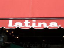
When I was in the Mile End neighborhood of Montreal a couple of weeks ago, I happened to spot this idiosyncratic logo on a local shop. First I noticed the van, pulling into a parking space outside the shop; then I realized that the shop itself was the business with the logo.

The letters are clearly a heavy, wide variation of Helvetica (or something modeled on it very closely), but someone has given these precise Swiss letters little tails, joining them up into a connected script. Nobody re-drew the letters; that’s obvious from the mismatch between the curl of the “t” and the much narrower joining stroke. (My guess is that the capital-L is really a cap-I with the joining stroke added.) It’s clever, even it’s mechanically rendered. And it’s certainly a strange juxtaposition of cultural tropes, all in a few letters on a shop awning and a delivery truck.

Logo on shop awning

Type designs from Mexico

Published

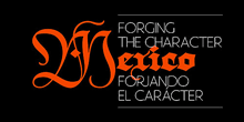
As called out recently on FontFeed, Mexican designer Isaías Loaiza Ramírez has posted on Flickr a bunch of images of Mexican typefaces in action, from the presentation first shown at TypeCon 2007 in Seattle. These images serve as an excellent fore-taste of the typographic exuberance that will be on display in Mexico City at the 2009 ATypI conference, Typ09.