Today’s New York Times has an article about the new credit-card legislation that just passed the U.S. Senate (and, later in the day, the House), which would limit the exorbitant interest rates and extra fees and sudden changes of terms that have become standard practice among credit-card companies in recent years. One of the details that I noticed deep in the article has typographic relevance:
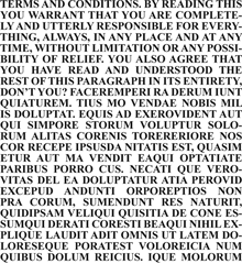
“The bill also bans expiration dates on gift cards and certificates any sooner than five years after the card’s original issue date. And the retailer or card issuer will have to print the terms of any expiration date in capital letters in at least 10-point type. Call it the fine print rule.”
Capital letters? I can see the intended effect, but the real effect will be to make the important text less readable than it would otherwise be. ALL-CAPS are inherently less readable and less inviting than upper- & lowercase – especially if they haven’t been tracked looser than normal, to give a little extra space between letters.
Legal contracts such as “Terms of Use” agreements often use all-caps to emphasize the most important parts. But if there’s a long passage in caps, it’s even more likely to be skipped by anyone reading it than the regular text might be. (Perhaps this is the point, in some legal agreements.) Far better would be to set the important bits in normal case but make it bold for emphasis. (Maybe not in Times New Roman, whose bold is really a headline typeface rather than a bolder version of the text face.)
Requiring “capital letters in at least 10-point type” does have one advantage: it’s easy to define. Although typefaces vary wildly in their apparent size, it’s usually the lowercase x-height that varies the most (compare Times and Helvetica at the same point size); the capital letters are likely to be of similar height even when the design is different. But this just highlights the folly of trying to define legible type simply by its point size.