function jdb_page_navigation()
sPageSlug = blog
sPageTitle = easily amused
header:139:aPageArgs:page_title = easily amused
header:140:aPageArgs:section_title =
functions-johndberry:262:aPageArgs:page_title = easily amused
functions-johndberry:298:sPageTitle = easily amused
functions-johndberry:359:sPageTitle = easilyamused

easilyamused |

Archive for 2008

Legible in Poland

Published

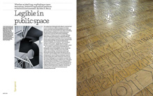
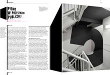
My recent article for Eye magazine, “Legible in public space” (first image at left), has been translated into Polish and will be published in the next issue of the Polish magazine 2+3D (second image at left), a design quarterly published in Kraków and devoted to “grafika plus produkt.”

2+3D looks like an interesting magazine, and I’m pleased to be in it. Wish I could read Polish.

Stern, the type

Published

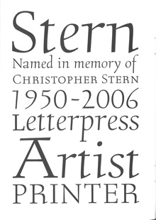
When I first opened the package from P22 with their press release and the specimen booklet for the typeface Stern, I didn’t make the obvious connection. I grasped quickly that it was a new design by Jim Rimmer, notable British Columbia punchcutter and type designer; and I understood that he was doing something unique by issuing the face both as a digital font and in foundry type for hand-setting. (There have been typefaces issued in multiple formats before, such as Sabon, and digital typefaces have been printed by letterpress, but I don’t think anyone has spanned the technologies quite this widely before.)

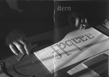
The obvious connection was the name: Rimmer had named his typeface in honor of artist/printer Chris Stern, whose work spanned the same broad swath of typesetting technologies, and who visited Rimmer and learned from him. It’s a fitting tribute, one that Chris would have appreciated.

He might even have put it to use in a book. The typeface Stern is unusual – “an upright italic type designed for hand-set poetry and diverse digital use,” as Rimmer describes it. The angle of the slant is very slight, as befits an upright italic, but the italic forms of e, f, m, and n give it a calligraphic feel.The wide, two-storey a creates a tension with the italic forms and makes it look more like a text face; there is, however, an alternate, single-storey a for occasions when you want a more consistently italic look. The caps are upright, and come in four different heights: tall, mid-height, small Aldine, and small caps. It looks like mid-height is the default, or at least that’s what was used in the elegant little specimen booklet designed by Rich Kegler.

In metal, Stern is a 16pt font, a size suitable for spacious settings of poetry or short prose passages. It’s a light and delicate-looking typeface, in both metal and digital form; digitally, of course, that lightness can be scaled up for use at display sizes. But it’s designed for use at large text sizes, and in the right circumstances, with careful treatment, it could shine. At first it looks peculiar, but it certainly grows on you.

Incidentally, the exhibit of Chris Stern’s printed work at Design Commission in Seattle has stayed up through July, and many of the broadsides and prints by printer friends of Chris’s are still available for sale; all proceeds go to paying off the huge medical bills that don’t go away even when you die.

In the spirit of technology-spanning, you can play with bits of the Stern letter forms at a site called Typeisart, which uses interactive Flash to let you create your own collage out of elements of the typeface. Watch out – it’s addictive.

Steampunk, steampunk everywhere

Published

What was once a recondite literary movement in the science-fiction field has blossomed into a popular-culture phenomenon, and as far as I can see it’s done so overnight. When the New York Times starts writing about “steampunk,” you know it’s attracting wider attention, and has probably already passed its peak. Written steampunk took a cyberpunk sensibility and injected it into a substrate of Victorian technology and sartorial style; it married our fascination with the brass-gears science epitomized by the Time Traveler’s machine in the 1960 movie The Time Machine with a noir-ish outsider take on 19th-century society. The extension of this into popular culture has been fun, though often silly. Some of the “steampunk” clothing appearing now just looks like retreads from The Wild, Wild West; and the application of clockwork skins to digital electronics is basically a matter of decoration.

This seems to have gotten up the nose of someone at Design Observer (that design website that I always intend to keep up with, but never do). Randy Nakamura wrote a screed about the humbug of steampunk; I noticed it when Bruce Sterling, who has some implication in the development of steampunk, quoted from it (“Design Observer Hates Steampunk”) and exclaimed, “Man, this is priceless. The backlash has begun!”

But my favorite bit, which makes this worth writing about, is a momentary fantasy that Bruce spun between quotes and comments: “Maybe Randy Nakamura would like ‘steampunk’ better if it was called ‘Eamespunk’ and involved making computers out of bent plywood.”

September in Peter’s town

Published

Registration is open for the 52nd annual ATypI conference (St. Petersburg, Russia; September 17–21, 2008). In fact, we’re coming up on the cut-off point for the discounted “very early” rates. After July 18, you can register at the “early” rate (still a discount); after August 15, only at the full rate. So it pays to plan now. The preliminary program is online already, and the website has information and advice on planning travel, including visas, and accommodation in St. Petersburg. See you there?

This upcoming weekend, we’ll see the other major type gathering of the year, TypeCon2008 (Buffalo, N.Y.; July 15–20, 2008); in fact, the pre-conference workshops should be happening right now. Unfortunately, I can’t make it to TypeCon this year, but I’m sure it will be enjoyable (even if I won’t miss re-experiencing an East Coast summer’s heat and humidity). This year, as I pointed out to SOTA director Tamye Riggs, is the tenth anniversary of the first tiny TypeCon, held in an exurban hotel in Westborough, Mass.

And I just got off the phone this afternoon with Roger Black, discussing plans for next year’s ATypI conference, in Mexico City. Both St. Petersburg and Mexico City mark expansions beyond ATypI’s traditional heartland of Western Europe and occasionally North America; this seems appropriate given the widespread nature of type in everyday life.

Cow down

Published

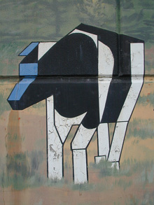
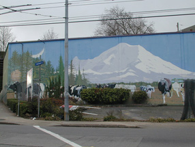
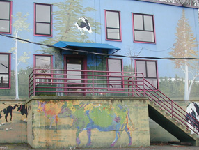
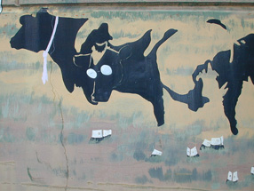
There was no typography involved, but there were a lot of different styles and schools of art. The mural was painted twenty years ago on the side of an utterly nondescript light-industrial building on East Madison Street in Seattle, the home of a locally owned icecream company called Fratelli’s. Its subject was cows, not unusual for an icecream manufacturer. But the cows that covered the side of the Fratelli’s building came in a collage of visual styles, each one reflecting the characteristics of a particular school of painting. There was the Cubist cow, the Impressionist cow, the Jackson Pollock cow. Looming behind them all was the outline of Mt. Rainier, the 14,000-foot volcano that dominates the horizon of Puget Sound. The forms interlocked and interacted in ironic and playful ways, all in the context of what, on the surface, appeared to be a pastoral scene. To walk or drive past this mural was to be reminded of how whimsically and creatively art can spring up.

Detail of cow mural

Fratelli’s went out of business years ago, and for quite some time the building has been awaiting demolition, to make way for some kind of redevelopment on the site. I’ve watched ivy grow over parts of the mural, and more recently large spray-painted graffiti tags appear on top of the lower cows. This past week, finally, the wreckers came, and the building was reduced to rubble.

Several years ago, when the building had already been abandoned for a while, I borrowed Eileen’s digital camera and took a bunch of pictures of the mural – close-ups of each cow, and each odd architectural feature (like the way the artist incorporated the protruding base of the concrete stairway into the mural), as well as some shots from across the street to capture the whole thing together.

Detail of cow mural

Detail of cow mural

Zap!

Published

When I googled the name “Zapfest,” to find something I had written about the 2001 San Francisco celebration of calligraphic type, I was startled to find a link to something called “Zapfest 2008.” It turned out to be a one-day music festival in Oxford; it also turned out to be, for reasons unexplained, canceled. (Well, these things happen.) I don’t imagine the reasons had anything to do with possible confusion with a typographic festival that took place seven years ago, but it’s an odd juxtaposition. Clearly, for the organizers of the Oxford music event, the name breaks down into “Zap” plus “fest”; the combination “Zapf” would have been a coincidental one. But for those of us who know and admire the work of Hermann & Gudrun Zapf, it’s hard to imagine not immediately thinking of them and their work upon seeing such a name.

Incidentally, the book that came out of the original Zapfest exhibition is still available.

Vernacular information design

Published

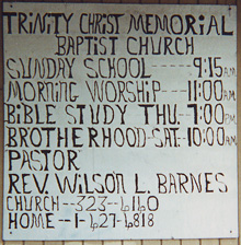
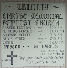
Everybody loves “vernacular typography,” or at least enjoys finding examples. This purely functional sign resides on a store-front church in a neighborhood in Seattle (not far, in fact, from the building with the faded “Roycroft Theater” sign that I noted last year). For several years, the church sign was characterized by the shaky lettering in the top image; I was never sure whether it was a deliberate style or the result of being painted by someone with a nerve problem. (Whatever the intention or the skill involved, presumably it served its purpose; the information was there, albeit in a rather peculiar form.)

More recently, that sign was replaced by the one in the bottom image – same information, mostly, but a more controlled sort of lettering, or at least a more formal set of models. Still not anything that would be mistaken for the work of a professional sign-painter.

Another road-sign attraction

Published

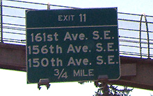
The photo to your left is of a highway sign on Interstate 90 westbound, a few miles outside of Seattle. It’s a fine example of the comprehensive street-numbering system of King County, and also of the fussiness of too many road and highway signs.

The next exit gives access to three different roads, each of them numbered. The important bit of information is the numbers of the roads themselves; the rest is dross. Why on earth did the sign-makers clutter up this freeway sign with junk like “st” and “th” and the periods in “SE”? It just distracts from the essential information, making it harder to get the message across in those brief moments a driver has while zooming down the highway.

The right way to do this sign would have been:

161 Ave SE
156 Ave SE
150 Ave SE

In fact, given the way streets are designated in King County, you could have dispensed with “Ave” and just said “161 SE” etc. But that might have offended the sensibilities of local drivers, who expect a little more deference to tradition. But the ordinal-number designations, and the utterly useless punctuation, are offenses against function and common sense.

I won’t comment on the oddness of a road system that has all three of these local streets coming off one freeway exit. That’s a problem for highway engineers, not signage designers.

Steve Renick: book designer

Published

I’ve been intending to write an article about Steve Renick and his work ever since his sudden death in 2002. Even before that, I had the idea in the back of my head. And clearly, such an article needs to be written, since when I google him in various ways, in search of the best link for his name above, in the first sentence, everything I come up with is partial and oblique. But this is not that article; it’s just a few notes towards one.

There isn’t a current exhibit of Steve Renick’s work that I can point you to, unless you drop by the offices of the University of California Press, where he was Art Director for twenty years. In their library/meeting room, last time I was there, they had a lot of Steve’s work on display; even without that intention, any display of books from UC Press in the past two decades would show a lot of Steve Renick’s work, either as designer or as art director. He was a consummate book designer, with an understated style in a sort of classical Modernist tradition. He was a typographer in the best sense; I remember that he had a Monotype type-specimen poster, from the days of hot-metal typesetting, under the glass top of his drawing table. We would talk about typefaces and books and the details of typography; I believe it was he who gave me a photocopy of the long-out-of-print book by Geoffrey Dowding, Finer Points in the spacing & arrangement of type.

I would try to visit Steve at the Press whenever I was in the Bay Area. He was always friendly, helpful, informal, and curious about whatever was new. I remember arriving one day when he had just gotten his hands on a Mac and an early version of QuarkXPress; he was noodling around, trying things out, finding out how the software worked, thinking about how he could incorporate these new capabilities into the way he designed books. At that point I had never used XPress, but I had been designing and typesetting books digitally for several years; we compared notes on digital type and how it was set.

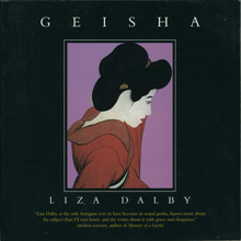
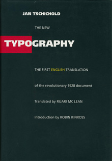
Many of the most high-profile books to come out of UC Press were Steve’s work, either designed by him or produced under his art direction: Henry Thoreau: a life of the mind, with Barry Moser illustrations; Geisha, by Liza Dalby; Poles apart: parallel visions of the Arctic and Antarctic, by Galen Rowell; the Allen Mandelbaum translation of Dante’s Inferno. He designed the remarkable English-language facsimile edition of Jan Tschichold’s Die Neue Typographie, the first time this classic of Modernist typography had appeared in English. That book, in fact, I had some responsibility for: I had been corresponding with Ruari McLean, Tschichold’s biographer and sometime translator, about getting his unpublished translation of Die Neue Typographie into print, when I found out that UC Press, all unknowing, was contemplating commissioning a translation, not realizing that a translation already existed in manuscript. I got hold of Steve, who put me in touch with the editor of the project; then I got the editor and McLean together and then left them to work out the best way to approach the book.

In contrast to his elegant, spare book designs, Steve’s hobby was fixing up old hotrod cars. (No doubt the engine details were as finely crafted as his typography.) I recall the first time he drove me to lunch in his current rod, and how flabbergasted I was at the apparent aesthetic contradiction of these two wildly different styles.

Steve was famously generous with his time and advice; everyone who has worked with him, been on a book-show jury with him, or just spent time with him remembers this. He was also resolutely unpretentious; in a group photo from a book-industry event, he would be the one over on the end with the rumpled jacket and oblique tie. He had an eagle eye for typography and a fine hand for design; his influence is easy to spot in the work of innumerable younger designers. Most of all, for book buyers and readers, he quite simply produced a wealth of books that we can read easily and that we can feel happy to have on our shelves.

Digital wood type

Published

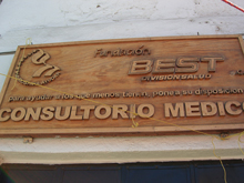
I took a couple of pictures of this sign over a shop in Valle de Bravo, Mexico, in February – not because it was picturesque or folkloric but precisely because it was such an odd mix of digital and hands-on technologies. The plaque and the letters were all made of wood, but the letters were all obviously digital in origin: carved in wood by machine from digital letter forms. The bold caps of ‘CONSULTORIO MEDICO,” in fact, look like Arial – the most digital of digital fonts. Yet the letters were also clearly carved separately from the plaque, and later attached; the seams were easy to see, and the spacing was what you might get from someone placing each letter by hand, while standing on a teetering ladder. If you look closely, you can even see that the n in “pone” (“pone a su disposicion”) is backwards – something that could only have happened from a physical mistake, not a digital one.

Detail of wooden sign in Valle de Bravo

Vernacular typography? Yes, Jim, but not as we know it.