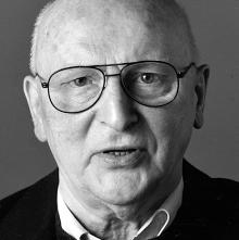
I was sad to hear the news that Günter Gerhard Lange had just died. GGL, as he was frequently referred to, was a central force in the typographic world. Through his long-time work at the Berthold type foundry in Germany, he set the standards of quality for type design in metal and later in photo and digital typesetting. Even in the United States, where Berthold was less well known, the big, square E2 Body Types type-specimen book from the 1980s was treasured. Often enough, it was the Berthold interpretation – that is, Lange’s interpretation – of classic typefaces that were judged the best. It’s easy to see, from studying the type samples, that even when he made changes to the original design, he always did so with their usefulness in modern text typesetting in mind. (Some compromises are always required in adapting a typeface from an earlier time to modern equipment; it’s what choices you make, and how you implement them, and in what spirit you do so, that makes the resulting new typeface usable or not.)
The only time I met Lange was at the 2000 ATypI conference in Leipzig, where of course he was a major presence. I wished that I spoke and understood more than a smidgin of German; he was renowned as an articulate and forceful speaker, though not in English. At the conference, the New York Type Directors Club presented him with its TDC medal, and I wrote about that event in one of my earliest “dot-font” columns for Creativepro.
[Photo: © FontShop, Marc Eckardt]

