function jdb_page_navigation()
sPageSlug = blog
sPageTitle = easily amused
header:139:aPageArgs:page_title = easily amused
header:140:aPageArgs:section_title =
functions-johndberry:262:aPageArgs:page_title = easily amused
functions-johndberry:298:sPageTitle = easily amused
functions-johndberry:359:sPageTitle = easilyamused

easilyamused |

Archive for December, 2008

Entropic typography

Published

In the spirit of the expiring year, here’s a bit of decayed lettering on the awning of a car-repair shop in my neighborhood in Seattle. Digital distressing has nothing on the ravages of weather and sunlight. I’m not sure which is more poignant, the choice of typeface (Avant Garde?) or the phrase that it spells out (“Computerized Automotive Repair”).

‘Computerized Automotive Repair’

Not so fine

Published

Everybody has forwarded this link to me, though Deb Gibson was the first. I’m familiar with the book, Geoffrey Dowding’s Finer Points in the Spacing and Arrangement of Type (1954, reissued in 1966), though all I have is the Hartley & Marks reprint from 1995 and a xerox of the original that Steve Renick gave me many years ago. I have not actually seen this remarkably poor binding typography face to face, but if it is really the way the title was embossed on the cloth in the original edition, I can only speculate about what Dowding might have said about it at the time. As Loren MacGregor put it to me the other day, “I suspect the book was bound by someone not familiar with the contents.”

The “Fail” folks aren’t the first ones to notice this unfortunate conjunction of title and execution; it was also noted on the Hoefler & Frere-Jones blog back in January, under the title, “Precisely What the Author Had in Mind” – a longer but perhaps clearer description than the noun-cluster “Proof of Concept Fail.”

Dowding’s book is well worth seeking out, though even the Hartley & Marks edition is out of print. I think he carried his argument for tight spacing slightly too far, but he was right in principle; and he gave close thought to the details that make text typography good or mediocre.

Signage on the hoof

Published

I love seeing how things actually get made. This set of Flickr photos shows the shop that manufactures the highway signs for Washington State.

As successive photos reveal more of the underlying letters, and the visible part seems to be “ypo,” I find myself fantasizing that it will turn out to be spelling “Typography” – or perhaps the little-known Washington town of Typopolis. It is, however, “Keyport.” Oh well.

[Photo: Distributed by WSDOT under Creative Commons license.]

Guerrilla pixels

Published

In a daring daylight raid, elements of the Microsoft Typography team carried out an action targeted to advancing the cause of macro-typography and raising the visibility of fonts in the most literal way, says our anonymous informant.

Since the Microsoft Typography team, along with the rest of Windows International, was moving to a new building on the Microsoft corporate campus over the weekend of December 12, it seemed only appropriate to make a visible statement about the importance and ubiquity of type in the visual environment. Through the use of six-inch-square pixels cut out of sticky-backed black vinyl (a technique used previously for an installation at the Design Commission during TypeCon Seattle), these large-scale representations of bitmap characters from the Verdana and Georgia type families appeared without warning on the walls of the new building. This was reportedly achieved without a single X-acto-based industrial accident.

Verdana and Georgia were originally commissioned by Microsoft for onscreen reading of text. The way they were designed was the opposite of the usual process of designing type for the screen. Instead of creating outlines and then hinting the outlines (giving them rules to follow when turning into bitmaps at small sizes), type designer Matthew Carter started by designing the bitmaps – the end result that he wanted to see at each size – and then worked with hinting wizard Tom Rickner to create outlines and hinting that would achieve those shapes. The letters of the wordlet “typo” on the wall of Building 9 are taken from the bitmaps of 10pt Verdana and Georgia (in a mix of styles) at 96dpi. (Can you identify which letters are from which font, and in which style?)

The first versions of Verdana and Georgia were released in 1996; they now represent an early stage in the development of digital type at Microsoft. What will it look like when the MST commandos attempt to represent grayscale hinting and ClearType subpixel rendering at wall-size scale?

GGL

Published

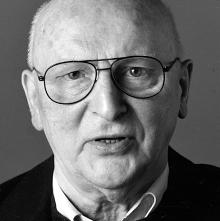
I was sad to hear the news that Günter Gerhard Lange had just died. GGL, as he was frequently referred to, was a central force in the typographic world. Through his long-time work at the Berthold type foundry in Germany, he set the standards of quality for type design in metal and later in photo and digital typesetting. Even in the United States, where Berthold was less well known, the big, square E2 Body Types type-specimen book from the 1980s was treasured. Often enough, it was the Berthold interpretation – that is, Lange’s interpretation – of classic typefaces that were judged the best. It’s easy to see, from studying the type samples, that even when he made changes to the original design, he always did so with their usefulness in modern text typesetting in mind. (Some compromises are always required in adapting a typeface from an earlier time to modern equipment; it’s what choices you make, and how you implement them, and in what spirit you do so, that makes the resulting new typeface usable or not.)

The only time I met Lange was at the 2000 ATypI conference in Leipzig, where of course he was a major presence. I wished that I spoke and understood more than a smidgin of German; he was renowned as an articulate and forceful speaker, though not in English. At the conference, the New York Type Directors Club presented him with its TDC medal, and I wrote about that event in one of my earliest “dot-font” columns for Creativepro.

[Photo: © FontShop, Marc Eckardt]