function jdb_page_navigation()
sPageSlug = blog
sPageTitle = easily amused
header:139:aPageArgs:page_title = easily amused
header:140:aPageArgs:section_title =
functions-johndberry:262:aPageArgs:page_title = easily amused
functions-johndberry:298:sPageTitle = easily amused
functions-johndberry:359:sPageTitle = easilyamused

easilyamused |

Archive for November, 2008

“No independent or detached existence”

Published

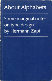
I had nothing new to bring with me to Seattle’s typographers’ pub last Tuesday, so I brought something old: my copy of Hermann Zapf’s little book, About Alphabets: Some marginal notes on type design by Hermann Zapf. I’ve always liked the ambiguity of that subtitle-cum-author’s-name: yes, the book is by Hermann Zapf, but it’s also true that the type designs discussed in it are all by Zapf as well. So it works either way.

It seemed appropriate to bring this particular book, since November 8 was Zapf’s 90th birthday. I’m not sure what kind of celebration was held in Darmstadt, but I know it was an anniversary that was appreciated in many corners of the world.

In Paul Standard’s preface to the 1960 book (my MIT Press paperback is the 1970 edition), he writes: “If the foregoing lines say much of books, it is because type designs have no independent or detached existence. Types are produced with great effort at great cost, produced for use in printed matter required for learning or study or for industrial or commercial needs. And HZ’s supreme concern, whether in writing or in printing, is never the single letter but the fusion of such letters into a working text.” Although digital type can be produced without the great cost inherent in the older industrial technology, a good text face – which is what Standard is talking about – still takes enormous effort and skill. And their purpose is still, as it always is, their weaving together into meaningful text.

Scrambled Eggs & Whiskey

Published

One of my favorite American poets, Hayden Carruth, died in September at the age of 87. I had the honor and the pleasure of designing two of his books, for Copper Canyon Press, as well as designing a new cover for a reissue of his Collected Shorter Poems. One of the new books I designed had the wonderfully evocative title quoted above (“It’s what we used to have for breakfast,” he said).

Recently, I finally got around to subscribing to the long-running magazine Poetry, and the first thing I read when my first issue arrived was not a poem but W.S. di Piero’s account of spending time with Hayden Carruth. Di Piero’s final anecdote, about Hayden going walkabout before a TV interview, particularly pleased me. I can’t claim to have known Hayden more than slightly, but I do recall an evening in New York City a few years ago when Michael Wiegers and I picked up Hayden at his hotel and took him downtown to the New School, where he was supposed to do a reading. He claimed it was going to be his last city reading (“I hate this place,” Mike remembers him saying), and perhaps it was; I haven’t checked.

The taxi we caught to take us downtown was driven by a classic New York cabbie, the kind of long-time driver who regaled us with tales of his encounters with savvy traffic cops over the years. (“But officer, there was no sign there telling me I couldn’t turn left.” “Sure, buddy, but you’ve been driving a long time; you know perfectly well that there used to be a sign there. I’m giving you a ticket.”) This character and his stories delighted Hayden.

At the New School, there was a noisy social gathering upstairs before the event, and after a while I noticed Hayden ducking out the fire door to the stairs. I figured I’d better follow him; I knew Mike had told me that he worried that Hayden would bolt. I found Hayden on the sidewalk out front, sitting on the curb and smoking a cigarette. I don’t smoke, but I joined him on the sidewalk, and we talked companionably for a while. When he was done with his cigarette, we just got up and took the elevator back up to the event, where Hayden gave his reading to great applause.

Minister without fontfolio

Published

Well, someone must be reading this stuff. The other day, John D. Boardley, who runs the website I Love Typography, posted this Photoshop mash-up (it’s rather far down the page in his “week in type” for November 11). He was presumably inspired by my off-the-cuff remark a couple of weeks ago about the need for a Minister of Typography. Thanks to Jennifer Kennard, who pointed this out to me; it cracked me up when I saw it. And you certainly won’t find me complaining; I think I’m in good company.

Boardley made a connection between this notion and an idea expressed by Robin Kinross in Unjustified texts: “Could typography be a topic of regular and intelligent discussion in newspapers? […] If music, architecture, cookery and gardening have critics and columnists, then why not typography?” Kinross was taking off from an idea of Erik Spiekermann‘s (“The typographer Erik Spiekermann set off this hare in his book Rhyme & reason, in which he complained that one could never read discussion of typography there”), and it’s a point I’ve made myself when arguing for more public design and typography criticism. Although Boardley says the Kinross quotation is “not completely related – this is just how my mind works,” the connection seems logical enough to me.

Toronto: design, tech, celebration

Published

Last weekend Eileen and I were in Toronto for the wedding of Cory Doctorow and Alice Taylor. It was my first time in Toronto since 1973, except for changing planes once or twice in the airport, and Eileen’s first visit ever. The hotel of choice for incoming guests was the Gladstone, once a notorious flophouse at the far edge of Queen Street West, now meticulously restored as a boutique hotel with each room decorated by a different artist. The neighborhood, known as West Queen West, seemed to be the funky artistic center of the city (or at least one of them) – the sort of place we would naturally gravitate to. It was a good setting for this confluence of digitally and geographically dispersed people, ideas, and creative energy.

This was a gala affair, though not exactly…um, traditional. The ceremony itself – admirably brief and amusing – was conducted by a magician, and there was a sort of steampunk Halloween theme to the whole celebration. Jack-o-lanterns were carved on the day before, and the event took place in a haunted house – well, actually in a great Victorian pile known as Casa Loma, the extravagant folly of a wealthy Toronto capitalist who went broke getting his mansion built. Costumes were the order of the day; Cory appeared at the Mad Hatter, and Alice as, well, Alice. The star of the show, of course, was their eight-month-old daughter, Poesy Emmeline Fibonacci Nautilus Taylor Doctorow (“Poe”).

Toronto had its share of type and design; in fact, the Queen West neighborhood is officially designated the “Art + Design District,” something I’ve never seen in any other city. And who could resist a bookstore named “Type”? (The sign “pre-loved” is actually the name of the shop nextdoor.) That’s where I bought Robert Bringhurst’s new book about Canadian book design, The Surface of Meaning.

A bookstore called Type

Toronto subway signage

[Photos: left, Alice Taylor (top), Cory Doctorow holding Poesy (middle), brain pumpkin as table centerpiece (bottom); above, signage on the street (top) and in the subway (bottom).]