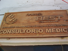
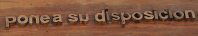
I took a couple of pictures of this sign over a shop in Valle de Bravo, Mexico, in February – not because it was picturesque or folkloric but precisely because it was such an odd mix of digital and hands-on technologies. The plaque and the letters were all made of wood, but the letters were all obviously digital in origin: carved in wood by machine from digital letter forms. The bold caps of ‘CONSULTORIO MEDICO,” in fact, look like Arial – the most digital of digital fonts. Yet the letters were also clearly carved separately from the plaque, and later attached; the seams were easy to see, and the spacing was what you might get from someone placing each letter by hand, while standing on a teetering ladder. If you look closely, you can even see that the n in “pone” (“pone a su disposicion”) is backwards – something that could only have happened from a physical mistake, not a digital one.
Vernacular typography? Yes, Jim, but not as we know it.