
I just wrote an article for Eye, the excellent graphic-design magazine out of London, about type and lettering on public buildings. It’ll be in the spring issue, Eye 67. The starting point for this piece was Rem Koolhaas’s new Seattle Public Library, and the original ways in which really big type was being used for some of the internal signage. The article expanded far beyond there, of course. (It’s embarrassing to remember how long ago I first spoke with John Walters, Eye’s editor, about doing such a piece. It’s one of those subjects that just keeps expanding; I wouldn’t be surprised if it ended up as a book.)
There’s a lot of smaller-scale signage in the library, too – the sort of ordinary informational stuff that everyone has to deal with. I took a bunch of photos of the SPL signage, in the course of my research. Only one of them ended up in the magazine, but I was intrigued by some of the side-roads and byways that didn’t get covered in a more general article. One unexpected juxtaposition is illustrated here: an informational sign from the library (left), which was free-standing at the top of the “books spiral,” SPL’s unique form of library stacks; and another free-standing sign (below), using the same typefaces and remarkably similar color and shapes, which I noticed next to the fuel pumps in my local gas station on Capitol Hill.
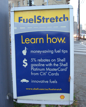
Coincidence? Well, yes, probably. But it’s a surprising bit of design echo, in two entirely different contexts that are only about a mile apart. Fill ’er up! Would you like a book with that?