function jdb_page_navigation()
sPageSlug = blog
sPageTitle = easily amused
header:139:aPageArgs:page_title = easily amused
header:140:aPageArgs:section_title =
functions-johndberry:262:aPageArgs:page_title = easily amused
functions-johndberry:298:sPageTitle = easily amused
functions-johndberry:359:sPageTitle = easilyamused

easilyamused |

Archive for December, 2007

Gone baby gone

Published

Okay, here’s a good example of type used creatively. You may have seen these ads for the recent movie Gone Baby Gone; this one is from the Arts section of today’s New York Times. There’s nothing very subtle about the ad as a whole (big close-up head shots, lots of WORDS IN ALL-CAPS, excited declarations of awards and award nominations, a cacophony of visual noise), but the use of descending weights of type in the title is evocative, playing off the meaning of the words themselves. Not beautiful, but expressive and appropriate.

I won’t say anything about the competing sans serifs around it. My lips are sealed.

Maximum unreadability

Published

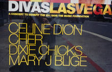
This is a nearly perfect example of how not to space type, if you want the words to be read. It was a poster-size ad on the side of a bus stop near the 16th Street BART station in San Francisco; I snapped this photo several years ago, but I still haven’t run across a better bad example.

It’s a good thing the names are familiar; otherwise you might be wondering who “Oeune Don,” “Dxe Choks,” and “Mary J Buge” were. Perhaps if you were standing around for a long time waiting for a bus, and you had nothing better to do than puzzle out what this says, it would be effective. But the real point of advertising on bus shelters isn’t to reach the captive audience of bus-riders; it’s to catch the attention of the people driving by – for whom this collection of letters would look like a rickety bunch of yellow sticks.

If typography is all about negative space, this is negative typography.

Thots on Starbucks

Published

When I first arrived in Seattle, at the tail end of 1975, you had to go to another neighborhood just to find an espresso. Starbucks was a little shop in the Pike Place Market that sold bulk coffee and tea, with a single outpost on Broadway, on Capitol Hill, a short but steep walk away from where I lived. And they didn’t sell espresso in those days; that came later. For that full sipping-an-espresso experience, you had to go to one of the city’s hip student coffeehouses, such as the Last Exit or the Allegro, in the University District.

That changed. When Starbucks became an international chain of coffee bars, I realized that what it was really selling wasn’t just coffee: it was design. Or at least the feeling of design. (This raises all the perennial questions about the relationship between design and style.) Quite simply, it felt good to go into a Starbucks and spend some time there – sort of like having coffee in an art-museum café.

What Starbucks is these days, as far as I can see, is basically a caffeine-based soda fountain. In a lot of Starbucks outlets, they look at you funny if you order a straight espresso; they have to go searching for a real espresso cup. An Overhead Hemi Double Frappuccino Nonfat Mocha, on the other hand, they can handle with ease.

This isn’t a bad thing, except for those of us who like straight espresso. The American soda fountain was a cultural institution and a social gathering place; its demise has been a loss for American culture. If Starbucks fills that gap, I won’t complain, even if they do so by imitating the sweet soda-fountain offerings of my youth (with an extra jolt for the workaholic). Well, maybe I’ll complain a little.

[Photo: the original Starbucks logo, currently found only on the original Starbucks store, in Seattle’s Pike Place Market. Photo by me, this afternoon.]

Grate expectations

Published

This is one of my favorite pieces of decorative iron grillwork in San Francisco – a city full of decorative grills. Most of them are simply security grates in front of doorways or windows, but even those usually take the form of something elaborate, even baroque. This one, on a neighborhood bar in the Mission District, is stark in its simplicity (though the bright red wooden frame does rather spoil the effect).

Despite the frame and what looks like fake-wood paneling, this is not a view from inside the bar, but from the outside, on the street.

Have you seen this poster?

Published

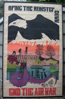
If you’ve been to our house, perhaps you have, though it’s currently displayed in an unconspicuous place. I’ve had this poster since I picked it up on the street in Berkeley, California, sometime in the early 1970s; most likely during the year I lived in San Francisco after graduating from college in 1971. I bought it not just for its political content but because it was beautiful. But I’ve never been able to find out who made the poster.

It’s silkscreened, in many colors. There’s no signature. The art is brilliant, the lettering very funky (deliberately, I assume), and the vertical placement of the word “DOWN” is witty. But who did it? I asked David Lance Goines, who I thought might know, but the artist he suggested wasn’t working in Berkeley that early in the ’70s. Have you seen this poster before, or other work by the same artist? I’d love to solve this mystery at last.

When I got this framed, several years ago, by the Seattle artist and frame-shop owner Kay Rood, she reminisced about her days in France in May 1968, helping student radicals print revolutionary posters for that spring’s huge demonstrations. But alas, she said ruefully, it never occurred to her to keep copies of any of them.

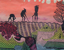
[Update, Dec. 14:] I’ve added a close-up of a detail from the poster, to give a little better idea of what the artwork is like. Some of it reminds me of cut-paper techniques and of woodblock prints, though this is silkscreened.

Typographer’s lament

Published

Browsing through a local bookstore yesterday, I kept picking up interesting-looking new books and opening them, only to put them down again when I saw the inside typography. An uninviting text page can put off any reader; it’s just that as a typographer and a book designer, I can tell exactly what it is that puts me off.

Thomas Pynchon’s Against the Day, in Penguin trade paperback: typeset in an overly contrasting version of Baskerville (probably ITC New Baskerville, though I couldn’t be sure), in lines that were two or three picas too wide for comfortable reading. John Crowley’s The Solitudes, in the newly reprinted edition from Overlook, is set in Rotis Serif, a typeface that looks superficially attractive but consists of a mismatched set of letterforms in which the most common letters are quirky and draw attention to themselves.

The Landmark Herodotus sounded fascinating: a spacious volume, informatively annotated, bedecked with useful maps. But its text type appears light and blotchy throughout. The typeface is Matthew Carter’s excellent ITC Galliard, but it looks like the early Adobe version, which was indifferently digitized and has a poorly spaced italic. The numbers are all set in lining uppercase numerals, jutting up to full cap height, instead of old-style lowercase numerals, as befits any text, and especially a translation of a classic. In addition, the page design doesn’t quite fit the binding; it’s a thick book, and the gutters are too narrow, which would make reading uncomfortable.

I found one fine exception: Maps: finding our place in the world, edited by James R. Ackerman and Robert W. Karrow (University of Chicago Press). The typeface is Dolly, which is robust and easily readable in extended text, and the page design uses it effectively. That one I might actually buy. It’s the shame the same designers didn’t take on the Herodotus.

Helvetica outtakes

Published

My copy of the Helvetica DVD arrived a couple of days ago – you know, Gary Hustwit’s full-length documentary about a typeface, which has become inexplicably popular far beyond the typographic world. What this film does more than anything else – more than tell us about the actual typeface Helvetica, though it does that quite well – is show us how ubiquitous type is in the world around us, and how this obscure practice, typography, is something we live with every single day. That, I imagine, is the source of its wider appeal.

I’ve been browsing the DVD’s “Extras” – outtakes and extra material that didn’t make it into the movie. My favorite quotes are from Neville Brody and Erik Spiekermann:

Neville Brody on type in the world: “All schools should be teaching typography. We should be fundamentally aware of how typographic language is forming our thoughts.”

Erik Spiekermann, after describing how he’s been re-designing the timetables for the German railroads: “That stuff is what makes a nation’s culture: it’s the visual surrounding. You know: good architecture, good food, and good timetables, or good announcements on the walls of stations – I think that’s a very important cultural contribution.” [Erik Spiekermann]

I was also pleased to hear that, like me, Erik looks first to the lowercase a when identifying a typeface.